
You’ll notice a coincidence: the right exterior color often sells a home faster than the best features do. Start with a neutral base—warm beige, gray, or taupe—and use a subtle accent to highlight architectural details without overpowering. You’ll want to test samples in various lighting and weather, then fine-tune with complementary trim for cohesion. Ready to win buyers with curb appeal that feels timeless and inviting, yet tailored to your home’s unique character? There’s a practical path you won’t want to skip.
Identify Exterior Colors That Sell Homes Fast
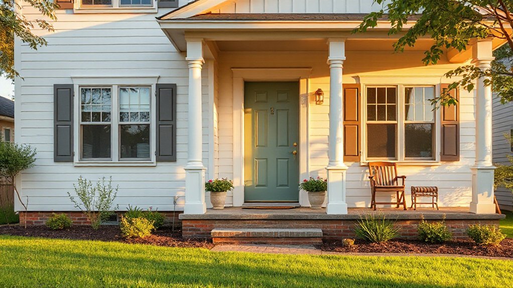
When buyers inspect a home from the outside, the first impression often determines whether they’ll look closer. You choose exterior colors that calm, unify, and highlight architecture, not clash with neighboring homes. Start with a dominant neutral base—warm beige, gray, or taupe—and add 1–2 accent tones to shape curb appeal.
Avoid overly bold combos that distract from features or imply high maintenance. Test paint samples on a small wall area at different times of day to see how lighting interacts. Use garden lighting to extend appeal after dusk and emphasize contrast points.
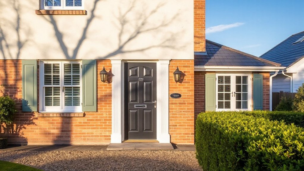
Pair front door decor with a complementary front door color to create a welcoming focal point. Keep the palette cohesive, practical, and resale-friendly to attract fast offers.
Timeless Exterior Palettes That Don’t Go Out of Style
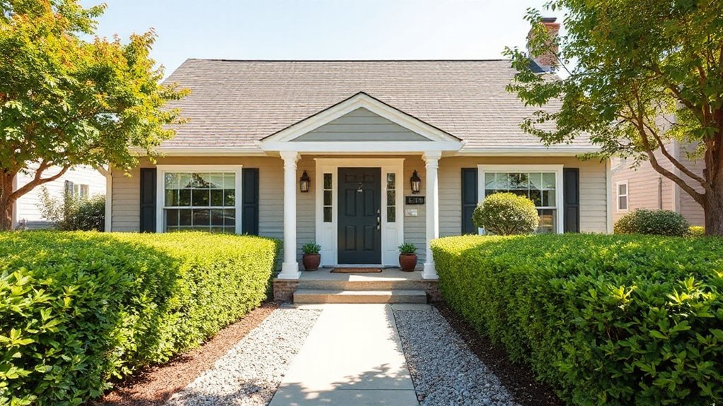
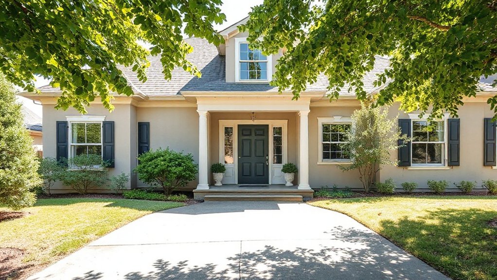
Timeless exterior palettes stay appealing because they emphasize architectural features and endure changing trends. You’ll see why classic combos work: clean neutrals with restrained contrast highlight lines, textures, and massing.
Focus on low-maintenance finishes that resist fading and still feel fresh after years. Choose durable base shades—soft grays, warm beiges, or rich charcoals—and pair them with precise accent colors to define doors, trim, and façade details.
Garden integration matters: plan plantings and hardscape to echo your palette, softening progressions and boosting curb appeal without overpowering the architecture. Seasonal color adjustments should be subtle, like swapping ornamental pots or foliage accents to reflect changes in light and season, not wholesale color overhauls.
This approach preserves value while staying inviting year after year.
Current Modern Trends for Curb Appeal
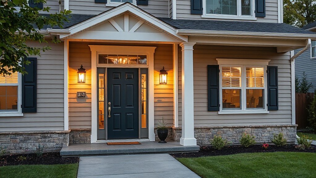
Modern curb appeal hinges on bold, purposeful color pairings and textures that stand up to daily wear. You’ll see current exterior palettes favor contrast—dark trim with lighter facades, or warm neutrals accented by charcoal.
Plus, durable finishes that resist fading are also popular. Ready to test these trends on your home, so you attract buyers with a polished, low-maintenance look.
Modern Curb Appeal Trends
Curb appeal today leans into clean lines, warm neutrals, and thoughtful landscaping that makes a home feel welcoming from the street. Modern curb appeal trends focus on cohesion between exterior finishes, simple textures, and purposeful plantings that highlight architectural features.
You’ll see streamlined front facades, contrasting trim, and restrained color accents that don’t overwhelm. Integration of garden landscaping with hardscape elements creates instant structure, guiding the eye toward the entry. Front door styles become focal points, often paired with pops of seasonal color and durable, low-maintenance materials.
Practical updates deliver lasting impact without overhauling the whole exterior.
- Emphasize clean lines and balanced proportions with selected pathway and planting alignment.
- Choose a front door style that complements trim, hardware, and lighting for cohesive curb presence.
- Use durable, low-maintenance garden landscaping that adapts across seasons.
Current Exterior Color Palettes
Curious about what’s selling homes today? Current exterior color palettes lean practical, with subtle contrast and durable finishes that endure years of weather. You’ll see neutrals—greige, taupe, and soft greys—paired with deeper accents on doors or shutters to create focal points without shouting.
This approach supports curb appeal by balancing warmth and sophistication, making homes feel inviting from the street. Consider tested combos: pale body with charcoal trim, or warm ivory with deep navy entry.
For texture, mix stone or siding with painted trim to add depth. Plan your landscaping around palette shifts, emphasizing garden landscaping that complements the colors.
Don’t overlook outdoor lighting to extend evenings’ charm and highlight architectural lines, creating cohesive, buyer-friendly exteriors.
How to Test Exterior Color Samples Effectively
To test exterior color samples effectively, start by observing them on multiple days and in varying light—morning, noon, and evening—to see how they actually look outside your home. Color psychology matters here, as tones can shift emotion and perceived size; track these impressions under real conditions.
Also assess paint durability by noting chalking, fading, and gloss loss after weather exposure.
- Record precise color names and undertones you notice in each lighting scenario.
- Compare samples on a shaded wall versus direct sun to gauge true hue and depth.
- Note how durability indicators—etching, wear, or UV fade—appear after a few weeks, then choose confidently.
Siding Color Combinations That Boost Curb Appeal
Pair complementary hues to draw the eye without shouting, using a calm base and a slightly darker or lighter Proportional Trim Contrast to anchor the look.
Add Bold Accents strategically on doors or shutters to create focal points that guide buyers’ attention.
Keep the overall palette cohesive by balancing Complementary Hue Pairings with restrained trim and trim highlights for a polished curb appeal.
Complementary Hue Pairings
- Test a triad of tones on a small section to preview radiance and mood.
- Pair warm neutrals with cool trim for refined balance.
- Use a bold front door as a focal anchor to boost perceived value.
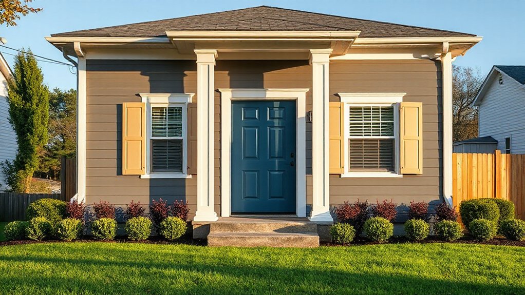
Bold Accents, Calm Base
Bold accents against a calm base create instant curb appeal by drawing the eye to architectural details without overwhelming the façade. You should pair a neutral main color with bold trim or a standout door to emphasize shaping, textures, and rhythm across the exterior.
Keep the base shade light or medium, then use a contrasting hue on accents sparingly to avoid visual clutter. Choose a color family that harmonizes with surrounding landscape to maintain cohesion with garden landscaping, planting beds, and pathways.
For durability and resale, test color samples at different times of day and in shadow. Consider driveway design compatibility—dark, clean lines can make bold accents feel intentional, not random, and improve overall perceived value.
Proportional Trim Contrast
1) Choose trim color that strengthens the base without overpowering it, creating a refined, memorable silhouette.
2) Pair mid-tone siding with slightly lighter or darker trim to evoke balance and durability.
3) Test contrasts at different times of day to confirm curb appeal and perceived quality.
How to Pick Trim and Accent Colors That Pop
Choosing trim and accent colors that pop is all about contrast, balance, and a touch of personality. Start with the main body color, then select trim that clarifies architectural lines without shouting.
Aim for a 70/30 or 60/40 split between dominant and accent areas, keeping the accent color restrained for curb appeal. Use color psychology to pick hues that evoke the mood you want—calm, inviting, or modern—while ensuring the palette reads clean from the street.
Test palettes on small, unpainted panels before committing, and consider how lighting shifts color perception throughout the day.
Prepare surfaces thoroughly: clean, repair, and sand as needed, then apply a high-quality primer to improve adhesion and color fidelity. Paint preparation protects longevity and avoids patchy results.
Matching Roof and Stone With Your Wall Colors
When pairing roof and stone with wall colors, start by identifying the dominant stone or roof tone and then align the walls to complement it rather than clash. You’ll create harmony by choosing wall hues that either echo the stone’s undertone or provide a subtle contrast that enhances curb appeal.
Leverage color psychology to pick shades that evoke warmth or calm, depending on your home’s vibe, while considering paint durability to withstand weather. Practical testing on small swatches helps prevent costly mistakes.
1) Choose a wall color that lifts the stone’s best undertone and feels welcoming.
2) Use a weather-resistant finish to maximize longevity and reduce touch-ups.
3) Pair warm neutrals with cool stone accents to balance contrast and buyer appeal.
Staying Within Neighborhood Norms for Block Consistency
Staying within neighborhood norms helps your home blend with the block and attract buyers who value consistency. Pay attention to curb appeal within norms, follow block consistency standards, and choose colors that respect the surrounding homes.
This practical approach keeps your property visually cohesive while still highlighting its unique charm.
Neighborhood Harmony Rules
Neighborhood harmony isn’t just about keeping peace with neighbors; it’s about preserving property values and curb appeal across the street. You’ll benefit by aligning your exterior choices with nearby homes, creating a cohesive streetscape that buyers notice immediately.
Focus on subtle contrasts, consistent trim, and surfaces that echo surrounding palettes. This isn’t about imitation; it’s about intentional contrast that feels deliberate and tasteful. Consider how garden landscaping and driveway materials fit the neighborhood rhythm, reinforcing a polished block impression.
- Align color accents with nearby homes to reduce visual disruption and boost appeal.
- Choose durable materials and textures that mirror local choices for longevity and resale value.
- Plan entryway and foundation tones to harmonize with the street, inviting buyers indoors.
Block Consistency Standards
Before choosing your palette, verify block compliance with any HOA or municipal guidelines, and document approved color codes for paint records.
Select one primary hue as a unifying thread, then introduce a restrained secondary that complements nearby homes without clashing. Use durable, fade-resistant finishes to maintain color integrity over time.
With disciplined coordination, color consistency reinforces the narrative of a well-maintained, harmonious block.
Curb Appeal Within Norms
To boost curb appeal without clashing with nearby homes, you’ll align your property’s approach with prevailing norms around upkeep, materials, and visual rhythm. Staying within block standards helps buyers feel instantly familiar, reducing objections and increasing perceived value.
- Observe the palette of neighboring houses and select a shade family that harmonizes without blending into every brick, then finish with durable, low-maintenance coatings.
- Integrate garden accents and porch decorations sparingly, choosing materials that echo common textures in the street for cohesion and quiet impact.
- Tuck tasteful, weathered elements like planters or lanterns into sightlines, ensuring repeatable rhythm from curb to entry, so your home reads as part of the neighborhood story.
Color Choices by Sun Exposure: Light, Climate, and Temperature
Sun exposure dictates how paint colors behave over time, so pick tones that stay true despite sun, heat, and UV glare. You’ll choose lighter, cooler hues for strong sun to reduce fading and heat absorption, and warmer neutrals where afternoon rays soften the look.
In areas with intense sun, test pigments for color drift during peak hours to avoid surprises at resale. Consider temperature variations when selecting white bases or grays; cooler whites resist yellowing in humidity, while warmer whites counterbalance blue-gray shadows.
For climates with big diurnal swings, lean on pigments with higher tint strength and better UV stability. Prioritize coatings rated for exterior exposure and document performance visibly for buyers, so color endurance reinforces perceived value and curb appeal.
Make Small Spaces Look Bigger With Contrast
Contrast creates perception: by darkening trim and shadows, you draw the eye along edges, making corners recede and spaces feel larger.
Brighten walls to bounce light and emphasize vertical, shadowed edges to enhance depth, giving a taller look.
Use these moves together to craft a crisp exterior that reads bigger and more inviting from the curb.
Contrast Creates Perception
When you use contrast wisely, small spaces feel larger because the eye follows sharp edges and distinct zones, creating the illusion of depth. You’ll leverage color relationships to guide attention, thicker trim, lighter walls, and a true edge between surfaces for perceptual expansion.
This technique hinges on color symbolism and practical choices that enhance curb appeal while maintaining paint durability, so your investment lasts.
- Clarify focal points with contrasting accents that draw the eye to architectural details, not clutter.
- Use durable, washable finishes on high-traffic areas to sustain the contrast without frequent touch-ups.
- Pair symbolism with texture—neutral walls with bold, meaningful trims—to evoke emotion while preserving longevity.
Darken Trim, Brighten Walls
Darken the trim and brighten the walls to instantly enlarge a small space. You’ll create contrast that visually expands rooms without tearing out features or adding square footage. Use a darker trim color to frame architectural details—doors, windows, and shutters—so the eye travels along a longer path.
Keep walls lighter to reflect natural light and to appear more expansive. Choose hues with gentle shade variation rather than stark shifts; subtle shifts prevent busy walls that shorten perception.
Guarantee color harmony across exterior elements—stone, siding, and accents—so the contrast feels intentional, not random. Test samples on a small area at different times of day to confirm the balance.
When done right, this approach yields a brighter, more welcoming façade that buyers notice immediately.
Shadow Edges, Taller Look
Shadow edges create the illusion of height and depth, making small spaces feel taller without adding square footage. You can leverage contrast to achieve a taller look by pairing lighter walls with slightly darker trim along boundaries, creating defined borders that draw the eye upward. This technique is practical, affordable, and repeatable across facades, soffits, and entryways.
- Heightful impact: choose edge contrasts that emphasize vertical lines for a perceived taller look.
- Subtle grading: apply gradual shading along corners to elongate walls without harsh shiftings.
- Pop accents: introduce a complementary shadow edge at the doorway to anchor the eye upward.
Employ shadow edges consistently across trim, gutters, and shutters to maximize perceived height and boost curb appeal.
Buyer Psychology: Colors That Feel Warm and Welcoming
Colors that feel warm and welcoming can instantly create a buyer-friendly mood, signaling comfort and livability from the moment a visitor steps inside. You’ll leverage color psychology to guide impressions, selecting hues that invite lingering, not just passing glances.
Opt for earthy neutrals as base tones, then introduce subtle accent colors at entryways and trim to highlight architectural features. Color symbolism matters: warm reds, ochers, and soft terracotta tones suggest hospitality, while muted greens imply balance and growth.
Consider the emotional impact of your palette on first-time buyers—cohesive schemes reduce decision fatigue and feel more move-in ready. Pair exterior color with natural textures to reinforce warmth.
Keep consistency across doors, shutters, and siding for a confident, inviting curb presence.
Budget-Friendly Pathways: Paint Quality vs. Coverage
When you’re budgeting exterior paint, the choice between quality and coverage isn’t just a price decision—it’s a value decision. You’ll balance long-term look, effort, and maintenance, not just the upfront tag. Consider paint texture and coverage rates to avoid rework, and weigh durability against cost per square foot.
Clear, even coverage saves coats and time, while better texture hides minor flaws and preserves color psychology under harsh light.
- Prioritize one high-quality coat over two mediocre layers to maximize curb appeal and minimize callbacks.
- Choose a paint with good hiding power to reduce coats, saving both material costs and labor time.
- Pair your color choice with a finish that enhances endurance—better texture, fewer touchups, stronger first impressions.
Exterior Paint Finishes and Buyer Perception
Exterior paint finishes don’t just protect siding; they shape buyer impressions, too. When you choose finishes, you influence perceived quality and maintenance ease. Matte hides minor imperfections, but might show dirt sooner. Eggshell balances softness with durability for most facades.
Satin offers a subtle sheen that enhances architectural details without glare, making entrances feel welcoming. High-gloss accents catch attention but can highlight flaws, so use sparingly.
Color psychology matters: cooler tones convey cleanliness and order, while warmer hues feel approachable. Enduring paint durability matters to buyers who dread frequent touch-ups, so select finishes with proven wear resistance and easy cleanability.
Consider how finish interacts with lighting and materials, ensuring consistency across features like trim and shutters. Your goal: longevity, curb appeal, and confidence for future buyers.
Maintenance Considerations That Influence Color Choice
Maintenance considerations should guide your color choice because the right hues hold up under sun, rain, and dirt better than others. You’ll benefit from choosing colors with proven Color durability and patterns that hide weathering. Consider how you’ll apply and maintain coatings to preserve curb appeal over time, paying attention to surface prep and appropriate primer and finish choices. A thoughtful approach to paint application reduces touch-ups and costs, while expanding your long-term color options.
- Choose durable finishes and low-maintenance pigments to minimize fading and staining.
- Plan for proper surface prep, priming, and weather-aware application to maximize longevity.
- Schedule routine inspections and timely touch-ups to sustain cohesion between colors and trim.
A Step-by-Step Color Plan to Finalize Your Palette
A practical, step-by-step color plan starts by grounding your choices in the durable finishes and maintenance insights you just reviewed.
Begin with a core palette—two neutrals, one accent, and a trim color—that reflects your home’s architectural details and surroundings.
Assess color psychology: choose hues that convey size, warmth, and curb appeal, then test samples under different lighting to confirm consistency.
Map each color to its role: body, door, shutters, and accent features, noting required primer and number of coats for paint durability.
Prioritize high-durability exterior finishes and low-maintenance options for long-term payoff.
Narrow options to three viable schemes, compare resale-friendly contrasts, and finalize with a documented plan.
This clarity guarantees cohesive curb appeal and confident, timely decisions.
Frequently Asked Questions
How Do Regional Climate Changes Affect Paint Longevity and Color Choice?
Regional climate shifts reduce paint durability and require climate adaptation. You’ll prioritize lighter, reflective colors in hot areas and breathable, mold-resistant finishes in humid zones to extend life and maintain curb appeal. Check UV resistance and proper substrate prep.
What Color Palettes Appeal to First-Time Home Buyers Specifically?
You’ll appeal to first-time buyers with neutral, curb-friendly palettes like warm grays and soft beiges, plus accent doors. Highlight front yard landscaping and well-kept driveway paving to create immediate, practical, aspirational polish they can envision.
Do Local Housing Ordinances Restrict Certain Exterior Colors?
Yes, you should check local ordinances, because color psychology and curb appeal strategies can be restricted by rules on exteriors, signage, or materials. You’ll plan compliant tones, document exemptions, and communicate choices with neighbors and inspectors.
How Important Is the Entry Door Color Compared to the House Body?
Like a quiet proverb, the entry door color matters, but the house body dominates; you’ll lean on entry door symbolism and color psychology trends to make a warm first impression, guiding buyers without overpowering architectural harmony.
Can Accent Colors Affect Perceived Neighborhood Value or Appreciation?
Accent colors can boost Neighborhood perception and influence Property value. You’ll help curb appeal and cohesion, signaling care. By choosing tasteful accents, you influence buyers’ impressions, potentially increasing perceived neighborhood value and accelerating appreciation.
Conclusion
Think of your house as a blank canvas waiting for its best story. The palette you choose paints first impressions, arrows pointing buyers toward warmth, reliability, and care. Use timeless neutrals as the frame, let a confident trim signal pride, and sprinkle subtle accents like a well-placed door signpost. Test colors in real light, balance finishes for durability, and keep maintenance in mind. When harmony wins, your home becomes a beacon that invites interest and closes the sale.