
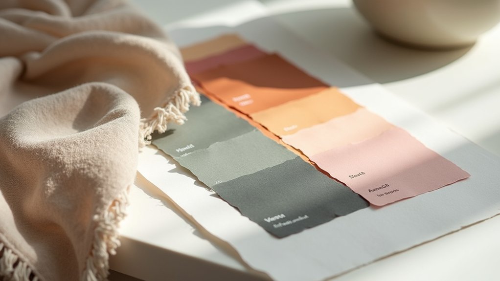

You’ll discover time-tested palettes that designers rely on, built on a neutral foundation, a precise 60-30-10 distribution, and textures that stay timeless. Start with warm or cool neutrals to set the mood, then use dominant neutrals, two accents, and a grounding tone for balance. Test swatches under daylight and artificial light, layer textures, and keep pops subtle for focal points. If you crave deeper guidance, you’ll uncover practical steps that reveal more when you continue.
What Color Actually Delivers for a Room

Color is what you notice first, but performance is what matters. You choose color not for aesthetics alone, but for measurable impact on mood, function, and flow. In practice, the right hue should support task efficiency, reduce fatigue, and align with how a room will be used.
Color psychology guides you to balance brightness, saturation, and temperature to influence perception—warm tones can invite intimacy, cool tones promote focus, and muted palettes reduce distraction. Yet you must account for Cultural influences that alter reactions to pigment, lighting, and context, ensuring your choices resonate with occupants.
Deliver real value by testing swatches under typical daylight and artificial light, validating with occupants’ feedback, and confirming durability of finishes. Your final palette delivers clarity, consistency, and intentional performance across spaces.
Neutrals as the Core You Can Rely On
Neutral tones form the backbone of versatile interiors you can rely on. You leverage neutrals as the stable framework for varied schemes, ensuring consistency across materials, textures, and lighting.
In practice, you deploy warm and cool neutrals to modulate mood without overpowering focal pieces. This approach supports efficient layering, from textiles to finishes, while preserving resale appeal.
Color psychology informs your choices: neutrals influence perceived space size, calm, and sophistication, enabling controlled atmospheres that align with client objectives.
You also consider cultural influences, recognizing how regional preferences and symbolism shape neutral selection and pairing.
By anchoring designs in reliable neutrals, you reduce decision fatigue, accelerate approvals, and deliver timeless rooms.
The result is scalable palettes that adapt to evolving trends without losing coherence.
Warm vs Cool Neutrals: When to Use Each
Warm neutrals warm the space, making rooms feel cozy and inviting.
Cool neutrals balance the composition, keeping rooms airy and visually calm.
Use the contrast to guide mood and function—let warmth anchor comfort, while cool tones support clarity and restraint.
Warm Neutral Warms It
When you mix warm neutrals into a space, they create an inviting, cohesive feel that advances comfort without overpowering the design. Warm neutrals—think creamy whites, taupes, and biscuit-toned beiges—draw light softly, making small rooms feel larger and more intimate.
They pair with wood tones and natural textures to enhance tactility, reinforcing a calm, grounded atmosphere. In practice, use warm neutrals as the backbone for living areas and bedrooms where you want continuity and subtlety.
Color psychology supports this approach: warmth evokes safety, approachability, and stability, guiding user comfort and perceived space size. Their emotional impact is steady, reducing visual fatigue while supporting accent colors without competing for attention.
Reserve cooler neutrals for high-contrast schemes or spaces demanding crisp, modern edges.
Cool Neutrals Balance Rooms
Cool neutrals create a crisp, balanced backdrop that counteracts warmth without feeling cold. You use cool neutrals to temper saturated accents, preserve architectural light, and keep spaces versatile for varied functions.
In practice, blue-greyes, greige, and charcoal taupe read as sophisticated but nonconstraining, enabling you to layer texture and material without competing with statement pieces.
Color psychology guides your choices: cool neutrals shift emphasis to form, light, and rhythm, enhancing perceived room height and clarity. The emotional impact remains calm, collected, and modern, making them ideal for work zones, bedrooms, and open-plan living areas.
Use contrast with warmer textures or metals to prevent flatness, ensuring the palette delivers depth while maintaining a cohesive, legible narrative.
How to Distribute Color: The 60-30-10 Rule
The 60-30-10 rule helps you establish a Dominant Color Foundation, an even balance that reads as intentional across spaces. Use 60% for the dominant color, 30% for secondary supporting tones, and 10% for accents to reinforce focal points.
This structure keeps your Accents And Balance precise, cohesive, and ready for any design challenge.
Dominant Color Foundation
So, what exactly is the Dominant Color Foundation? It’s the core hue you base a scheme on, typically occupying about 60% of the space. This foundation guides your atmosphere, influencing mood and perceived scale with intentional restraint. You’ll choose a color that aligns with function and lighting, then apply it across walls, large furniture, or major surfaces to establish cohesion.
Next comes the 30% supporting layer, which reinforces the foundation without competing for attention.
Finally, the remaining 10% acts as a precise accent strategy that reinforces intent without overwhelming.
Consider color psychology when selecting the foundation to evoke calm, energy, or focus. Also verify paint durability for high-traffic walls and frequent touchpoints, ensuring longevity and consistent performance throughout the design.
Accents And Balance
This framework prevents overwhelm while preserving visual energy. Use color psychology to choose hues that support function: calmer dominants for focus zones, warmer accents for inviting nooks. Maintain interior harmony by repeating undertones and ensuring consistent saturation across elements.
Balance also means restraint: resist adding competing tones that dilute impact. When applied with intention, the rule yields clarity, depth, and a timeless, professional interior palette.
Subtle Whites That Brighten Without Shouting
Subtle whites can brighten a room without dominating it, offering a clean canvas that enhances architectural details and natural light. You’ll leverage color psychology to evoke calm and focus, choosing whites with precise undertones that support mood and function.
Consider paint finishes that read differently under daylight and artificial light, from matte to satin, to balance glare and texture. The goal is clarity: subtle whites should recede, not compete, letting materials and fixtures speak.
Use consistent undertones across trim, walls, and ceilings to create a cohesive backdrop for statement pieces. Align white choices with room purpose and traffic patterns for longevity and cohesion.
- Note undertones that harmonize with existing materials
- Choose finishes that control glare and reflections
- Test in daylight and artificial lighting
- Pair with cool or warm accents sparingly
Building Depth With Earthy Tones

Earthy tones add depth by grounding spaces and creating tactile warmth that anchors modern design. You harness depth by layering: stone, wood, and clay read as natural textures, establishing a grounded backdrop that supports bold accents without competing.
Use a restrained palette—charcoals, ochres, olive greens—to create earthy contrast against lighter neutrals, guiding eye movement and defining zones.
In textiles, favor weave and nap to add dimensional interest; in finishes, matte surfaces reduce glare while preserving warmth.
Furniture with textured hides, timber, and ceramic details reinforces tactility, making rooms feel curated yet inviting.
Lighting should emphasize material character, casting soft shadows that reveal texture.
Maintain balance with negative space, so color weight remains intentional, ensuring cohesion across architectural features and décor elements.
Small Dashes of Saturation: The Accent Spark
When used sparingly, small dashes of saturation can illuminate spaces without overpowering the palette. You deploy subtle color pops to anchor focal points, guiding the eye without noise. This accent spark leverages color psychology to trigger intent—calm ceilings with restrained blues, energize nooks with warm terracotta, or crown a vignette with saturated greens.
Cultural influences shape which shades read as refined versus rebellious in a given market, so you tailor accents to local taste while preserving global legibility. Use sparingly, then let neutrals breathe.
- Targeted pops at key junctions
- Minimal quantities, maximal impact
- Coordinated with textiles and finishes
- Cultural-aware selections that respect context
Five Classic Palette Families Designers Trust
The Neutral Foundation brings calm and cohesion, balancing light and dark values to support luminance planning and material samples.
The Monochrome Spectrum emphasizes tonal variation within a single hue, delivering sophisticated texture without visual noise.
The Analog Harmony groups adjacent hues for seamless gradations, easing mood shifts while supporting spatial perception.
The Complementary Pairing leverages high-contrast relationships to create focal points and dynamic energy without overwhelming rooms.
The Triadic Balance uses evenly spaced primaries to maintain visual interest with restraint.
Color psychology and psychological effects guide decisions, ensuring spaces feel intentional and comfortable.
Quiet Contrast: Pairing Matte Wood With Gleaming Surfaces
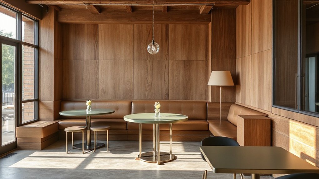
Matte wood brings warmth and tactility to a room, while gleaming surfaces reflect light and sharpen edges—together they create a quiet contrast that reads sophisticated rather than flashy. You harness texture and glow to guide depth, not dazzle, and keep interiors balanced.
- Pair matte finishes on cabinetry with high-sheen counters to anchor spaces without competing for attention.
- Use warm wood tones against glossy stone to amplify both materiality and luminosity.
- Layer matte furniture with gleaming hardware for a controlled, premium finish.
- Let natural daylight skim polished surfaces to reveal evolving reflections and subtle shifts in tone.
Vintage-Inspired Palettes for Modern Homes
Vintage warmth meets modern living as you blend timeless neutrals with subtle accents and textured woods. This approach nods to faded glamour while staying current.
Leveraging vintage-inspired palettes helps create cohesive, inviting spaces. Start with muted base tones, layer in distressed woods, and punctuate with restrained color pops that echo mid-century charm.
Vintage Warmth, Modern Living
Warm, earthy tones anchor vintage-inspired palettes in today’s modern homes, balancing nostalgia with current comfort. You’ll fuse vintage charm with modern minimalism, ensuring warmth without heaviness. The goal is cohesive living spaces that read tailored, not fussy.
- Embrace terracotta, olive, and charcoal for grounding accents that feel timeless yet fresh.
- Pair warm woods with matte metals to surface depth without clutter.
- Use textured fabrics (linen, bouclé) to convey cozy tactility amid clean lines.
- Layer lighting with amber glass and warm LEDs to cultivate a welcoming glow.
This approach keeps spaces intimate and livable, translating retro nostalgia into contemporary sophistication.
You maintain clarity, avoid ornament overload, and curate color relationships that endure.
Timeless Neutrals, Subtle Accents
Timeless neutrals form the backbone of vintage-inspired palettes for modern homes, creating a calm, cohesive backdrop that lets subtle accents shine. You’ll wield these neutrals as a sculpting tool, shaping rooms with restraint rather than spectacle.
Color psychology guides your choices, leveraging warm beiges and cool grays to influence mood and perceived space without overpowering details. In practice, you pair these neutrals with deliberate pops—muted blues, antique blush, or mossy greens—sparingly, to maintain balance and depth.
Pay attention to paint finishes: matte walls read serene, eggshell adds subtle sheen for high-traffic areas, and satin surfaces elevate trim or cabinetry with refined contrast.
Consistency across rooms yields flow; design decisions remain intentional, uncluttered, and timeless, ensuring vintage-inspired spaces translate smoothly to contemporary life.
Textured Woods, Faded Glamour
Textured woods bring tactile warmth and depth to vintage-inspired palettes, elevating spaces with natural grain, knots, and subtle rift patterns. You fuse aged character with modern clarity, delivering a refined sense of faded glamour that ages gracefully. The result: lasting sophistication without heaviness. Use these principles to guide material selections, finish choices, and accessory pairings.
- Select reclaimed or banked-tone woods to emphasize texture and history.
- Pair with matte metals and soft neutrals to sustain the faded glamour vibe.
- Opt for low-sheen finishes to preserve natural grain and tactile feel.
- Introduce occasional patina accents (fabrics, leather, stone) for contrast and depth.
Lighting and Its Impact on Color and Mood
Lighting governs how color reads on walls, fabrics, and finishes, so you must consider both the light source and the fixture when selecting palettes. You’ll optimize palettes by aligning color temperature with intended mood and function.
Natural illumination shifts perceived hue through the day, so plan shifts with adaptable whites and neutral bases that stay legible under varying daylight. In evenings, layer lighting—ambient, task, and accent—to control contrast and saturation, preserving color integrity.
Choose fixtures with high CRI to guarantee accurate color rendering, and calibrate fabrics and surfaces to the same reference. Remember mood enhancement hinges on balance: cool whites for focus, warm tones for coziness, and midtones for versatility.
Test swatches under multiple lighting scenarios to confirm consistent performance and confidence in your palette selections.
Color Tricks for Small Rooms That Scale
How can you make small rooms feel bigger without sacrificing style? You leverage color psychology and smart paint finishes to create perceived space, depth, and flow. Use light, cool neutrals on walls to expand ceilings visually, then introduce accent colors via trims and furniture to avoid monotony.
Matte finishes minimize sheen distractions, while satin or eggshell on doors and millwork adds subtle contrast without narrowing lines.
- Paint ceilings a lighter shade than walls to pull the room upward.
- Choose low-sheen finishes for walls; reserve high-sheen accents sparingly.
- Implement full-wall color blocks with a single, cohesive palette.
- Map color psychology to function: calming tones for small sleeping zones, brighter taps for compact work nooks.
Creating Maximal Coziness in Living Rooms
Plush textures matter because tactile comfort signals warmth and livability, from velvet cushions to tufted throws.
Warm neutrals consistently win, forming a cozy, cohesive base you can layer with accent hues without sacrificing serenity.
Soft lighting moments create intimate zones that invite lingering, guiding decisions on fixture placement, dimmers, and mood.
Plush Textures Matter
Texture isn’t just surface; plush materials can transform a living room by delivering warmth, comfort, and visual softness that anchors a layered palette. You’ll harness plush textures to elevate contrast, scale, and tactile interest, while keeping a cohesive, design-driven story.
Luxurious fabrics and textured surfaces read as deliberate, not indulgent, anchoring the room’s rhythm and inviting lingering eye contact.
1) Emphasize a tactile triad: throws, cushions, and upholstery in complementary hues.
2) Layer weaves of velvet, boucle, and faux fur for depth and warmth.
3) Pair matte ceramics with satin-finished textiles for balance.
4) Use scale variation to highlight focal seating without overpowering space.
Warm Neutrals Always Win
Warm neutrals aren’t boring; they’re the backbone of maximal coziness in living rooms. You leverage warm neutrals to ground richer accents, creating spaces that feel instant inviting without shouting. Choose a spectrum from creamy ecru to toasted beige, then layer texture and form to expose depth.
Color psychology supports this approach: earthy undertones foster comfort, while subtle contrast preserves clarity and focus. Consider cultural associations—warm neutrals can signal hospitality across diverse contexts, reinforcing a timeless, adaptable palette.
Pair with wooden beams, charcoal accents, and soft textiles to enhance tactility and sound absorption. Maintain balance by reserving bold notes for strategic focal points, not bulk surfaces.
In practice, your neutral strategy should read cohesive, calm, and deliberately curated, with every element reinforcing the living room’s coziness.
Soft Lighting Moments
- Layered luminaires create depth and intimacy.
- Dimmable outputs concentrate warmth where you linger.
- Amber-tinted bulbs soften blues and grays.
- Strategic placement guides conversation and flow.
Calming Color for Home Offices
Calming colors optimize focus and reduce visual fatigue in home offices. You’ll prioritize restrained palettes that balance warmth and clarity, avoiding high-contrast schemes that distract.
In practice, choose hues grounded in color psychology: soft blues and greens foster steadiness, while neutral taupes and grays anchor productivity without stiffness.
Pair these with purposeful paint finishes—matte or eggshell for reduced glare, satin where you touch walls frequently, and a feature wall with a low-luster glaze to add depth without ornament.
Your aim is spatial quietude: limit saturated accents, test lighting at work hours, and guarantee color consistency across zones.
Integrate subtle textures through furnishings rather than loud color shifts, sustaining focus, reducing fatigue, and preserving professional coherence throughout the workspace.
Palette Strategies for Kitchens and Dining Rooms
- Use low-sheen neutrals on cabinets, then pop with botanical accents.
- Introduce a bold, statement ceiling to anchor zones.
- Balance warm woods with cool stone for longevity.
- Incorporate durable, easy-care finishes everywhere.
When to Use Color in Small-Scale Patterns
Small-scale patterns work best when you balance proportion with context, so you keep the design from feeling busy or dim. Apply color proportion guidelines to guarantee the pattern reads as an accent rather than an overpowering feature.
Use lighting to shift the perceived color as the space changes. Consider how small repeats interact with room scale, and let subtle color play across textiles, finishes, and architectural details to guide attention.
Small-Scale Pattern Balance
Color plays a pivotal role in small-scale patterns because it governs perceived balance and rhythm at close range. You’ll use color to control how a pattern reads up close, ensuring the motif remains legible without overwhelming the room. When color contrast is too high, the pattern feels noisy; when too low, it fades. Ground with a neutral or muted base, and introduce color as a strategic accent.
1) Apply color psychology to cue mood shifts without altering scale.
2) Balance pattern scale by pairing dense motifs with airy backgrounds.
3) Use limited hues to preserve cohesion across textiles and accessories.
4) Test color density under lighting to confirm stable rhythm throughout the day.
Color Proportion Guidelines
You’ve set the groundwork by balancing dense motifs with airy backgrounds; now apply color proportion to control how small patterns read at a glance. In practice, reserve the dominant hue for the pattern’s core, supporting tones for detailing, and a subtle anchor for contrast. This hierarchy keeps busy prints legible from a distance and focused up close.
Use color psychology to gauge how viewers will perceive rhythm, energy, and mood, then tailor the proportion accordingly. For surfaces large or frequent, favor a restrained palette with 60/30/10 proportions to maintain calm while preserving interest.
When patterns repeat on textiles or accents, keep pigment selection aligned with the room’s temperature and lighting. Balance precision with moderation to ensure cohesive, durable interiors.
Lighting Color Interplay
Lighting shifts color perception, so apply color in small-scale patterns only after evaluating the room’s light quality and timing. When you plan patterns, you must account for lighting ambiance and color temperature, not just palette.
Small prints can echo main tones without overwhelming the scheme, especially under mixed lighting. Use cooler temps to sharpen contrast; warmer temps soften details and create cohesion. Align pattern scale with lamp or fixture outputs to avoid color drift at night.
Test samples under daylight, LED, and ambient sources before committing. Be deliberate: subtle contrast beats bold bursts in compact spaces.
- Assess daylight versus artificial light before selecting patterns
- Match color temperature to room function and mood
- Prefer restrained contrasts for small-scale prints
- Validate color behavior at intended times of use
Sustainable Palettes: Longevity Over Fads
Sustainable palettes prioritize durability over current trends, ensuring rooms stay cohesive for years rather than seasons. You balance timeless neutrals with carefully chosen accent tones, creating a base that ages gracefully.
Lean on eco-friendly pigments to reduce environmental impact without sacrificing depth or saturation, and prefer pigments that resist fading in natural light. Recycled materials become your ally for surfaces, textiles, and furnishings, delivering texture and character without escalating waste.
Your approach centers on material longevity, not quick fixes; you select finishes and coatings with proven durability and low VOCs to sustain air quality. Pair this disciplined palette strategy with practical maintenance routines, ensuring the color story endures through use, cleaning, and evolving occupant needs.
The result is a cohesive, forward-looking interior that transcends fads.
How to Test Color Choices Before Committing
How can you confidently lock in color choices before committing? You test in context, not on swatches alone. Use color psychology insights to predict mood shifts under lighting, traffic, and function. Then run controlled paint testing to confirm hue behavior on-site, not just in a store.
Observe undertones at different times of day, and compare with existing materials to ensure harmony.
- Create a temporary wall sample under real lighting to assess color stability
- Test adjacent finishes (fabrics, wood, metals) for color balance
- Photograph at different times to track perceived changes
- Document results with objective notes to guide final decision
Color psychology and paint testing combine to prevent costly missteps and ensure confident commitments.
Quick-Start Plan to Implement a Designer-Approved Palette
To implement a designer-approved palette quickly, start with a concise, rule-based plan that translates concept into on-site action. Begin with core swatches aligned to your project brief, then lock in a limited, deliberate palette: three dominant neutrals, two accents, one grounding tone.
Map each color to function—wall, fabric, trim, furniture—so decisions stay actionable, not ornamental. Use color psychology to anticipate mood shifts; pair high-energy hues with balanced neutrals to maintain harmony.
Reference pigment history to explain longevity and provenance when clients ask why certain tones endure. Create a live board with labeled undertones, finish gloss levels, and specimen chips.
Implement a phased purchase schedule, triage substitutions, and document approvals. Finally, pilot the palette in a real room, adjust spacing, and lock in final specifications.
Frequently Asked Questions
How Do I Choose a Color That Feels Timeless?
Timeless color choices come from balance and context; pick hues with enduring appeal and flexible undertones. Remember color psychology guides mood, while Cultural influences shape perception, ensuring your palette remains classic, versatile, and thoughtfully aligned with your space.
What Colors Boost Mood Without Overwhelming a Space?
Color psychology shows you should use soft greens or warm blues to boost mood without overwhelming space, balancing with neutral accents. This approach delivers emotional impact, supports focus, and maintains harmony while you curate a calm, productive environment.
How Do I Test Paint Colors in Actual Lighting?
Paint testing starts by applying swatches to the wall and observing under varied lighting. You’ll compare daylight, incandescent, and LED. Lighting considerations matter; test in situ, review over 24 hours, and document color shifts for accurate decisions.
Which Hues Work Best for Small Rooms’ Scale?
For small rooms, light, cool hues like pale blues or greens visually expand space, guided by color psychology and cultural influences. You’ll maximize depth with warm accents, yet keep contrast subtle to preserve scale and clarity in every room.
How Can I Balance Bold Accents With Neutral Backdrops?
You balance bold accents with neutral backdrops by choosing an accent wall and contrasting trim options that pop yet harmonize. Use Accent wall ideas to guide color depth, and contrasting trim options to sharpen edges and grounding tones.
Conclusion
Color isn’t random magic; it’s measured psychology you can master. Use neutrals as your anchor, then layer warmth, depth, and subtle whites to brighten without shouting. The 60-30-10 rule keeps balance, while small-scale patterns add texture without overwhelming. A quick test—paint swatches on three walls and observe at different times of day. Did you know rooms with a 20–30% accent color feel more cohesive? Your palette should age well, not chase every fad.