


Color psychology in interior design guides how you shape mood and function through hue, saturation, and brightness. You’ll match blues for calm or reds for energy, balance warm and cool palettes to steer perception, and use neutrals to ground spaces without dulling intent. Culture, context, and lighting matter, so your choices must be precise and repeatable. Get ready to test how subtle shifts transform behavior, because the right palette can redefine every room’s purpose—and your next project hinges on the next choice you make.
What Color Psychology Means for Interiors
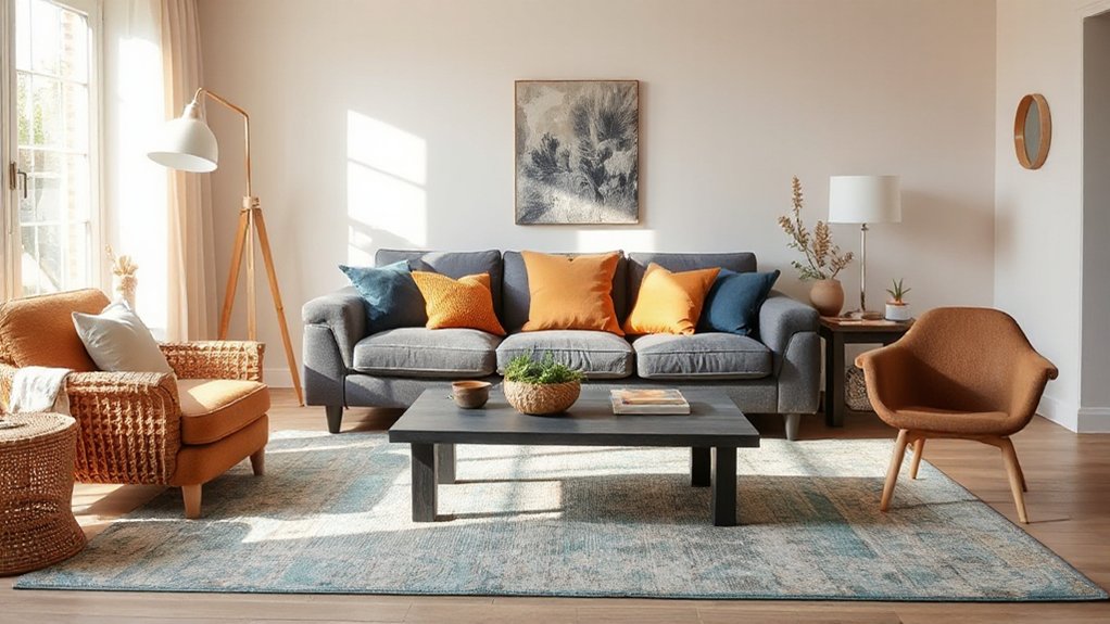
Color psychology for interiors helps you choose hues that influence mood, behavior, and perception of space. As you apply color psychology, you’ll map color symbolism to functional zones, aligning schemes with intended uses and occupant needs.
You assess how pigment relationships—hues, saturation, and value—alter perceived room size, focus, and cadence, informing trim, cabinetry, and textiles decisions. You consider emotional responses triggered by color pairings, ensuring combinations support desired experiences without overstimulation.
Practical methods include baseline neutral anchors, accent colors for focal points, and controlled lighting to preserve intended tone throughout the day. You document rationale for each selection, linking color symbolism to spatial roles, accessibility, and maintenance.
This disciplined approach yields predictable, repeatable results that enhance comfort, productivity, and overall interior quality.
How Warm and Cool Palettes Shape Mood
Do warm and cool palettes shift mood by altering perceived temperature and energy levels within a space? You’ll notice temperature cues influence physiological arousal and attention, shaping how you experience space. Warm palettes tend to elevate energy and sociability, while cool palettes promote calm and focus.
In practice, you pair hues with lighting and materials to elicit targeted emotional responses, aligning color choices with intended uses. Color therapy concepts guide decisions about saturation, value, and contrast to modulate mood without overwhelming senses.
Use precise measurements of luminance and color temperature to forecast outcomes, then validate with occupant feedback. The result is a controlled environment that supports task performance, relaxation, or social interaction, based on deliberate palette selection and ambient cues.
- Map color temperature to room function and expected energy levels
- Calibrate saturation and value to optimize emotional responses
- Validate outcomes with objective mood and performance indicators
The Science Behind Color Perception in Rooms
Color perception in rooms hinges on how your eyes and brain interpret light signals, including color constancy and chromatic adaptation. You’ll consider how room lighting interactions shift hue and brightness, altering perceived saturation and depth.
Cognitive color effects then shape how you respond to color choices, guiding practical design decisions.
Color Perception Mechanisms
Even though the eye processes light through a complex chain of receptors and neural pathways, your room’s colors are interpreted by a streamlined set of mechanisms that translate wavelengths into perceived hue, brightness, and saturation.
You rely on three core processes to form color experience: receptor signaling, opponent processing, and contextual interpretation, each refining how you perceive a scene.
Sensory signals combine with adaptation, enhancing contrast and stability as you move through space.
Color symbolism and emotional associations influence how you evaluate tones, even when objective measurements are identical.
Understanding these mechanisms helps you predict how color choices will feel in real rooms, not just on swatches or screens.
- Receptor signaling
- Opponent processing
- Contextual interpretation
Room Lighting Interactions
Lighting profoundly shapes how room colors read. When you adjust ambient, task, and accent lighting, you alter color temperature, brightness, and contrast, which shifts hue perception across surfaces. You’ll notice cooler temps enhance blue and green undertones, while warmer temps elevate yellows and reds, affecting perceived saturation.
The interaction between light source quality and material finish matters: matte textures diffuse, glossy surfaces glare, and metallics refract, changing color impressions as you move.
Color symbolism informs mood outcomes; a cool white can signal cleanliness, a warm amber suggests coziness. Emotional resonance follows from these shifts, influencing perceived space size and temperament.
Practical approach: calibrate lighting layers to support intended color stories, test compositions under representative daylight, and document spectral data to maintain consistency across rooms.
Cognitive Color Effects
- Size perception: warm tones appear more advancing, influencing perceived room scale.
- Mood mapping: cool, muted palettes suggest calm, aiding focus or rest.
- Function cues: contrasting accents reinforce zones and traffic flow.
How Culture Changes Color Meaning
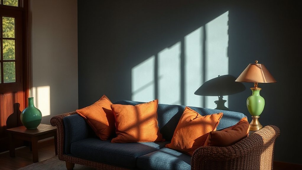
Culture shapes color meaning through context, history, and shared associations; a color’s impact shifts when you move between communities with different symbolic frameworks.
You approach color as a signal that must align with local expectations to avoid misinterpretation. Cultural symbolism informs how hues are read in design decisions, from branding to residential spaces, so you assess audience norms before selecting palettes.
You evaluate color semantics across cultures, noting which shades carry prestige, luck, or caution and how those meanings alter mood, perception, and usability.
When you adapt, you reference Traditional palettes as anchors, yet you tailor combinations to the target culture’s associations.
Document expectations, test responses, and correct course if feedback indicates misread signals.
Your goal: consistent function, respectful symbolism, and communicative clarity.
Neutrals That Calm, Focus, and Endure
Neutral tones can calm environments, sharpen focus, and endure under varying light and usage. You select neutrals to create steady cognitive performance and durable aesthetics, aligning emotional associations with functional spaces. Cultural symbolism informs how shade, undertone, and texture communicate restraint or openness, influencing occupant perception and behavior.
- Balance warmth and coolness
- Match materiality to lighting conditions
- Maintain legibility and accessibility over time
These steps ensure enduring quietude without sacrificing clarity. You’ll evaluate light sources, surface finishes, and furniture scales to preserve neutrality as a stable backdrop for work, study, or rest. This approach minimizes distraction, supports concentration, and resists trend-driven fatigue.
Emphasize low-saturation pigments with controlled undertones, and document color-data for repeatable results. By prioritizing emotional associations and cultural symbolism, you create spaces that feel calm, purposeful, and resilient through daily use.
Bold vs. Muted Accents: When to Use Color Pops
When you’re deciding between bold and muted accents, choose based on function, lighting, and desired energy level.
In practice, bold accents create focal points that draw attention and guide traffic flow, ideal for feature walls, statement furniture, or artwork where you want emphasis. Reserve bold accents for rooms with ample natural light or strong architectural lines, so color pops without feeling overwhelming.
Muted accents, by contrast, support a calm, cohesive base, stabilizing spaces that require focus or prolonged use, such as study areas or bedrooms.
Use bold accents sparingly to avoid visual fatigue; balance with neutral domains to maintain legibility. Consider contrast via undertone and saturation to ensure bold accents stay intentional, while muted accents preserve warmth and endurance.
Bold accents, muted accents—match intensity to purpose.
Lighting’s Effect on Color in Real Life
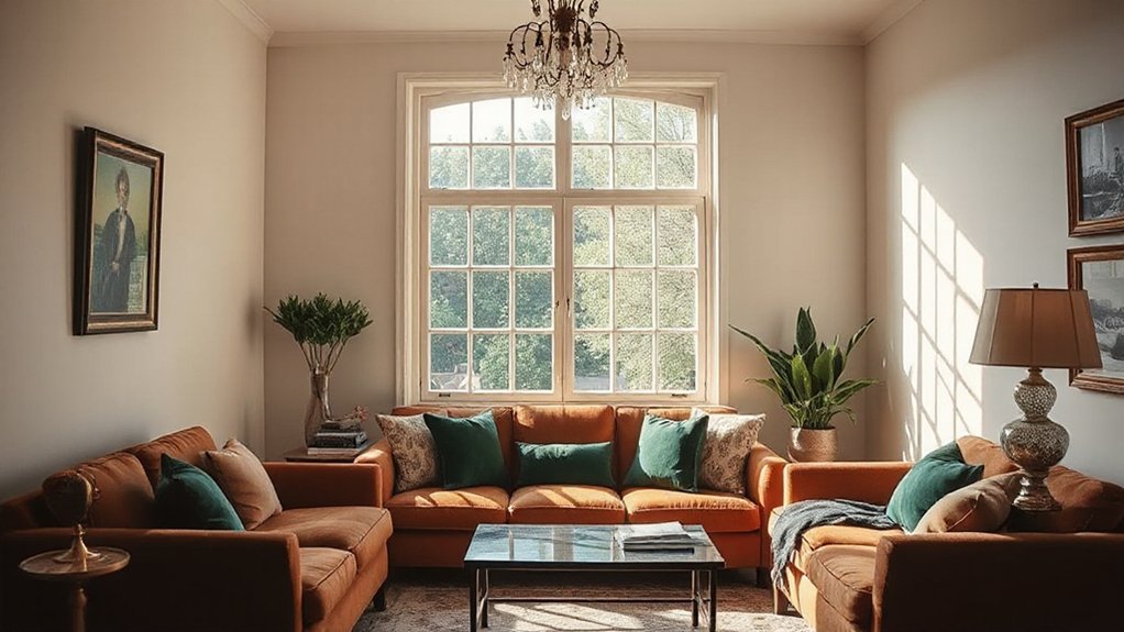
Lighting changes color perception in real life through warmth, glow, and shadows. You’ll notice warmer temps shift whites toward cream and textiles toward amber.
While cooler tones appear crisper under daylight; contrast, brightness, and fixture placement alter this effect. Use consistent lighting and test samples at project scale to anticipate how these factors influence mood and color accuracy.
Lighting Warmth Influence
How does warmth in lighting reshape color perception in real spaces? You experience color shifts as you adjust correlated color temperature, influencing perceived saturation and mood. Warmth lowers the Kelvin value, increasing yellow-red bias and enhancing coziness while softening contrasts.
In practice, you’ll notice furniture tones appear richer under amber-toned lighting, whereas cooler temps preserve chrome and midtones with higher clarity. This effect matters for color therapy and emotional resonance, guiding spatial storytelling and user comfort.
Maintain objective metering to compare daylight versus artificial light, ensuring consistency for evaluation.
- Control CCT to match design goals, documenting perceived changes in hue and depth.
- Calibrate luminance levels to avoid unintended color bias, using standardized test scenes.
- Evaluate user reactions across tasks, linking warmth choices to functional outcomes and mood.
Glow, Shadows, Perception
Glow and shadows shape how colors read in real spaces. You observe color behavior where illumination shifts a hue, saturation, or brightness as light travels across surfaces. In practice, you evaluate light temperature, direction, and intensity to predict perceptual changes, not just objective wavelengths.
Glow effects occur when luminance highlights one area, subtly lifting perceived brightness and altering contrast relations between adjacent surfaces. Shadow illusions arise where nearby objects block rays, creating cooler or warmer tone shifts that modify color confidence and legibility.
You should test combinations at multiple times of day, documenting how edges sharpen or soften, and how metallics or opaque finishes respond under varied illumination. This method assures consistent interpretation of color in client environments and guides accurate palette validation.
Room-by-Room Color Guidelines for Function

Color choices should align with how each room is used, because function drives mood and behavior. In this section, you balance practical function with color symbolism and psychological associations to support performance, comfort, and flow. You’ll set palettes that reinforce tasks, storage, and movement, while avoiding visual fatigue over long use.
Consider lighting quality, ceiling height, and reflective surfaces to maximize clarity and focus without distraction. Use color as a cue for hierarchy—quiet backgrounds for concentration, warmer accents for social spaces, and cooler tones where calm is needed.
Maintain contrast for legibility and safety in kitchens and baths, and opt for durable, washable finishes in high-traffic zones. Be deliberate, measurable, and consistent across adjacent rooms.
- Define room-specific color goals aligned with activity and mood
- Pair base neutrals with purpose-driven accent hues for function
- Test under real lighting, ensuring color symbolism respects psychological associations
How to Test Paint Color Without Regret
You’ll verify color choices in real conditions to prevent regret, linking test results directly to how the room will actually be used. Start with large, labeled swatches on actual walls at multiple times of day. Apply samples in two coats, allow cure, and observe finished appearance under natural and artificial lighting.
Reassess under typical tasks: reading, cooking, relaxing, or entertaining, noting how color influences mood, visibility, and focus. Use test lighting that matches your fixtures to reveal subtle shifts in hue and saturation.
Track color symbolism with intent—does the shade convey warmth, calm, or energy appropriate to the space? Document paint durability by rating finish consistency, washability, and resistance to scuffs.
Compile a decision log, then compare with initial goals before committing.
Using Color to Create Perceived Space (Size and Height)
Color choice can visually alter room dimensions. Lighter, cooler tones tend to push walls back, making a space feel larger.
Deeper hues advance surfaces and can reduce perceived height.
To manage height, apply darker accents at lower planes and lighter tones up top to create a vertical lift.
Use consistent saturation and avoid high-contrast color blocks that disrupt the perceived scale.
Perceived Space via Color
When you use color to shape perceived space, you manipulate visual cues that influence depth and scale. You’ll apply color to alter how surfaces read in a room, using lighter values to advance space and darker tones to recede. Height perception benefits from strategic saturation and brightness contrasts, creating a sense of proportion without physical changes.
Color symbolism and emotional responses guide your selections, ensuring mood aligns with spatial intent. Practical use involves paneling, wall planes, and accents, calibrated to maintain balance between foreground and background.
- Light, low-saturation walls to widen a room while maintaining cohesion.
- Darker trim against lighter fields to ground vertical height cues.
- Accent colors sparingly placed to draw focal depth without overcrowding.
Height Illusion Through Hues
Height adjustments through hue rely on how color value, saturation, and brightness interact with spatial cues. In practice, you’ll use cool, low-saturation hues on upper walls to subtly push ceilings higher, while warmer, medium-saturation tones anchor lower planes to create grounded depth.
Lightness contrasts amplify perceived height: lighter walls adjacent to dark trims elongate verticals without altering actual dimensions. Consistency matters: use a restrained palette to avoid competing cues that negate the illusion.
Color symbolism and hue symbolism can guide your selections—cool blues imply loftiness; warmer yellows suggest approachability. Yet, excessive brightness can flatten the space.
Apply test swatches at lighting levels you’ll maintain, and observe how daylight shifts the hierarchy of tones. Finalize with precise edge detailing to preserve the perceptual height without visual clutter.
Color Contrast for Readability and Accessibility
Effective color contrast is essential for readability and accessibility in interior design. You assess light-dark pairings for text, icons, and controls, ensuring minimum contrast ratios meet accessibility standards. Practical decisions include luminance, color depth, and reflective surfaces to reduce glare and improve legibility across lighting conditions.
You map color symbolism to function, using high-contrast palettes for critical elements while preserving the room’s emotional impact. Balance is key: too jarring contrasts degrade comfort, too subtle contrasts undermine usability.
You test with real users and adjust for devices and signage, considering color vision deficiencies. Implement a scalable system that documents contrast targets, accessible color names, and fallback options.
- Establish baseline contrast targets based on WCAG/accessible guidelines.
- Document color roles, luminance, and interaction states.
- Validate through user testing and iterative refinement.
Seasonal Color Schemes to Refresh Interiors
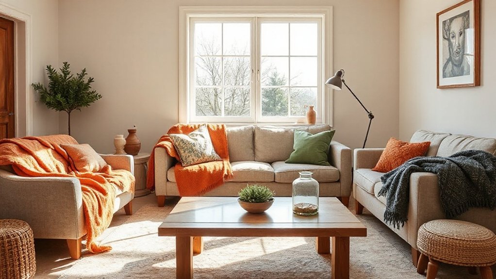
Seasonal color schemes refresh interiors by aligning hues with natural light shifts and occupant routines. You adjust palettes to reflect daylight changes, coordinating wall tones, accents, and fabrics with seasonal warmth or coolness.
Start with a baseline neutrals system, then layer color accents that map to anticipated daily rhythms and tasks. Color symbolism informs choices: consider calm blues for morning routines, energizing yellows for afternoon activity, grounding earth tones for evenings.
Integrate seasonal trends by sampling swatches under current lighting at similar times of day to ensure perceived hue stability. Use this approach to preserve perceptual contrast, readability, and mood.
Document updates in a small, repeatable protocol: select, test, refine, and implement, cycling quarterly to maintain cohesion across rooms.
Fostering Creativity With Color Choices for Kids
Color choices in kids’ spaces should actively spark imagination while supporting focused play and learning. You leverage color therapy to shape areas that invite exploration without overstimulation, aligning hues with activity types and cognitive targets.
Emotional resonance guides tone selection; warm accents can energize brainstorming corners, while cool neutrals stabilize concentration zones. You’ll balance saturation levels to maintain legibility and reduce distraction during tasks.
Practical implementations prioritize repeatable palettes, material durability, and lighting that preserves true color. Expect measurable outcomes: extended engagement, clearer task focus, and more expressive play. Use color strategically to scaffold creativity, not overwhelm it.
- Design zones with purpose-driven palettes that map to activities and outcomes.
- Calibrate brightness and contrast to support readability and focus.
- Test small iterations, tracking engagement shifts and mood indicators.
Practical Color Harmony Rules You Can Apply
Start with Color Balance Rules to keep rooms cohesive: pair dominant hues with supporting tones and neutral anchors to prevent visual fatigue.
Use Harmony Through Contrast by mixing warm and cool values and textures, so accents pop without clashing.
Apply these principles consistently across lighting, textiles, and furniture to create a deliberate, readable palette.
Color Balance Rules
Color balance is about pairing hues so spaces feel cohesive, not chaotic. You’ll apply practical rules to prevent visual overload while preserving character and function.
Start with a dominant color and support with a restrained secondary palette; limit accents to purposeful pops that crystallize intent. Maintain perceptual lightness balance to avoid heavy zones or washed-out corners.
Consider color symbolism and emotional resonance to guarantee the scheme communicates the intended mood without clutter.
- Establish a dominant hue across major surfaces, then introduce a complementary or analogous secondary palette for accents.
- Limit the accent color to two discrete elements per room, ensuring visual pauses without distraction.
- Verify tonal hierarchy by testing samples under lighting conditions to preserve balance from day to night.
Harmony Through Contrast
To create harmony through contrast, you balance light and dark values, warm and cool undertones, and saturated against muted tones so the room reads as intentional rather than random.
You establish a controlled hierarchy: primary contrast governs focal areas, while secondary contrasts guide progressions. Use a dominant neutral as a stable ground, then introduce a peak color to energize key tasks or accents.
Apply color symbolism to set intent—blue calm, red alert, green renewal—matching function to mood. Maintain emotional resonance by aligning saturation with activity level: high saturation where focus is needed, desaturation in rest zones.
Limit warm-cool clashes to two pairs, and guarantee luminance steps are measurable with a lightness scale. Test outcomes under varied lighting, adjusting hues, value, and chroma until the composition feels deliberate.
A Practical Workflow for Selecting Palettes
Developing a practical workflow for selecting palettes begins with defining the project’s constraints: space, lighting, function, and client goals. You then translate constraints into measurable targets, guiding color decisions with predictability and repeatability. Use a structured, iterative process to guarantee consistency across rooms and surfaces.
Color symbolism and psychological impacts inform early choices, narrowing options before finalization.
- Assess lighting conditions and material finishes to evaluate true color performance under real daylight and artificial light.
- Create a palette matrix that maps dominant, secondary, and accent tones to intended moods and functional zones.
- Validate the palette with digital and physical swatches, testing contrast, accessibility, and long-term viability against client goals.
Common Color-Design Pitfalls and How to Avoid Them

Even with a solid palette strategy, common color-design missteps can derail a project fast. You’ll avoid these pitfalls by confirming long-term impact before painting trim or selecting fabrics. Start by ignoring trends that clash with space function or lighting, then test color in context, not isolation.
Misapplied color can mute contrast or overwhelm focal points, so balance saturation with proportion and material texture. Consider color symbolism and emotional associations; align hues with room purpose and user needs rather than personal preference alone.
Guarantee static swatches translate to real-world daylight shifts, and document a controlled process for revisions. Don’t neglect accessibility: maintain sufficient contrast for readability and safety.
Finally, implement a clear post-occupancy review to verify that color outcomes meet intended psychological effects and design goals.
Frequently Asked Questions
How Can Color Affect Back Pain or Comfort in Interiors?
Color choices can influence comfort by reducing visual strain and highlighting supportive features; use gentle contrasts and cool neutrals. Color therapy aids relaxation, while mood enhancement supports perceived relief, encouraging ergonomic postures and calmer, pain-treduction routines.
Do Color Trends Influence Long-Term Design Satisfaction?
Color trends influence long-term design satisfaction because your emotional response stabilizes as you personalize space; color psychology guides choices, but practical longevity matters. You’ll prioritize timeless palettes, ensuring a coherent emotional response that endures beyond fads.
Can Color Choices Impact Cognitive Performance at Home?
Color choices can boost your cognitive performance at home. Color psychology links hues to focus, mood, and efficiency, shaping Emotional responses; you’ll notice sharper attention. This is not hype—balance cool tones with warm accents for sustained productivity.
How Do Lighting and Time of Day Alter Color Perception?
Natural light shifts color perception during the day, while Artificial lighting alters it at night; you’ll notice warmer tones under incandescent and cooler hues under daylight LEDs, affecting true color accuracy and mood.
What Budget-Friendly Color Swaps Maximize Room Impact?
“Quick win: swap bolder, affordable palettes for impact.” You update walls with crisp neutrals, contrast trims, and a creative accenting hue, using affordable palettes and creative accenting to maximize room impact on a tight budget.
Conclusion
Color choice governs mood, function, and longevity in interiors. By balancing warm and cool palettes, leveraging neutrals, and aligning culture and context, you create spaces that support calm, focus, or creativity. Apply practical harmony rules and a clear workflow to select palettes confidently, then test with samples before committing. Watch for common pitfalls like over-saturation or misjudged lighting. Ready to translate psychology into tangible rooms that work for real life—what color will your next space wear?