
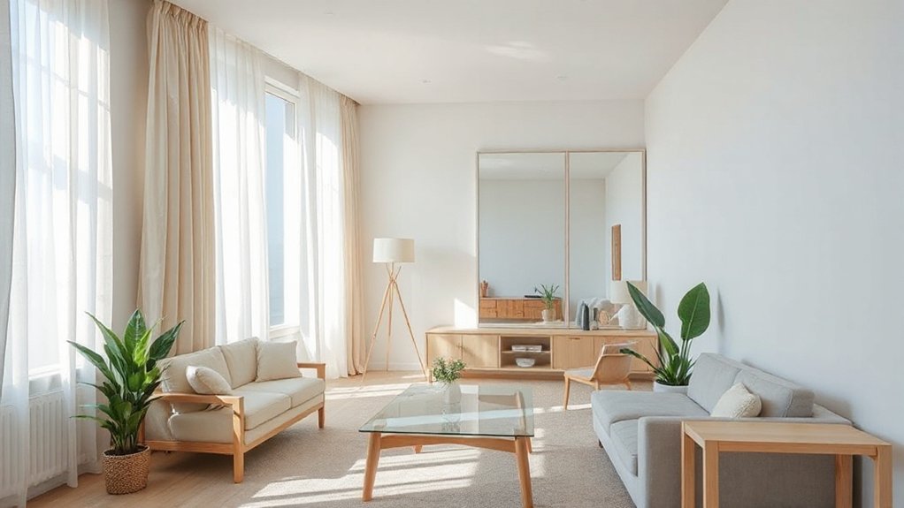

You can make a small flat feel bigger without major renovations by optimizing layout, light, and storage. Start with clear pathways, reflectors like mirrors, and a cohesive color story to boost depth. Choose multi-functional, slim-profile furniture and hidden storage to cut clutter. Let natural light flood in with sheer curtains and smart window placement, then layer lighting to add dimension. Implement a few reversible, budget-friendly tweaks and you’ll see the space breathe—but there’s more to optimize before you commit.
Define Your Small-Space Goals in 5 Simple Steps
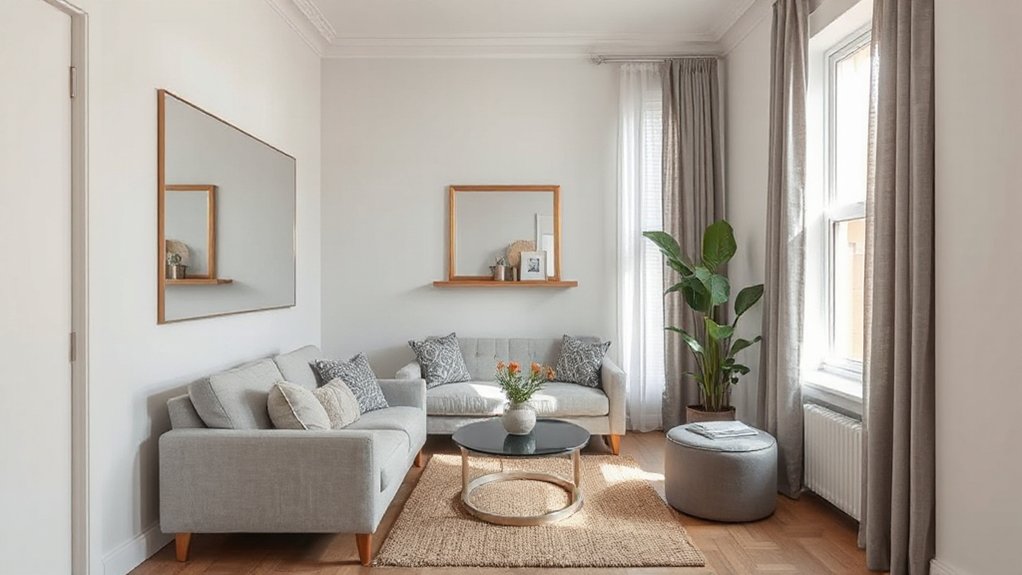
To define your small-space goals, start by identifying how you’ll actually use each area and what outcomes matter most. Step 1: map functions. Clarify primary tasks for each room, then assign essential furniture.
Step 2: prioritize pathways. Create clear routes, and remove unnecessary items to reduce clutter.
Step 3: set measurable targets. Define exact square footage you want to reclaim and the minimum seating you’ll tolerate.
Step 4: plan furniture arrangement before purchasing. Visualize layouts that maximize flow and accessibility.
Step 5: quantify ambiance, including scent enhancement, lighting, and acoustics, ensuring they support function without overpower. Document decisions in a simple checklist.
Revisit goals monthly, adjusting for changes in routine or storage needs while keeping the core space lean and purpose-driven.
Perceived Space First: Core Shifts That Make Rooms Look Bigger
You don’t need more space to feel bigger—you need the right perception. Perceived space comes from deliberate core shifts you control: sightlines, focal points, and scale cues that trick the brain into reading more room.
Start with a clear focal point and align furniture to create continuous lines. Use proportionate pieces that don’t crowd edges, so your walls breathe. Implement symmetry and balanced masses to reduce visual chaos.
Elevate perceived space by minimizing clutter and preserving negative space around key areas. Consider mirror placement to extend depth without adding bulk.
These core shifts redefine how you interpret dimensions, not actual size.
- Align sightlines for uninterrupted flow
- Choose proportional furniture
- Minimize clutter around primary zones
- Use balanced, symmetrical groupings
- Place mirrors to extend depth
Light, Not Loud: Choosing Colors for an Airier Feel
Choose light colors to keep the space feeling open and reflective, not heavy or crowded.
Use airy rooms with pale walls, subtle tones, and minimal contrast to maintain visual continuity.
Focus on color decisions that enhance brightness and perception of space, without adding bulk to the vibe.
Light Colors, Airy Room
Light colors open up a space by reflecting more light and creating visual continuity, so walls, ceilings, and furniture in pale tones feel more expansive. You’ll reduce visual clutter and heighten perceived space without renovations. Choose soft whites, beiges, and cool neutrals to keep reflections balanced.
Color psychology suggests light tones promote calm and perceived openness, while room acoustics benefit from lower contrast surfaces that diffuse sound differently. Pair walls with slightly brighter ceilings to boost vertical height.
Use textiles and furnishings in matching or analogous hues to preserve cohesion and echo control. Consider matte finishes to minimize glare that makes rooms feel busy. Introduce a few complementary accents for depth and texture.
- Keep palette cohesive across walls and ceilings
- Use matte or satin finishes to reduce glare
- Select textiles in analogous tones for softness
- Add subtle accent colors sparingly
- Monitor lighting for true color rendering
Subtle Tones for Space
Subtle tones can make a room feel open without shouting color. You’ll benefit by choosing light, low-saturation hues that reflect natural light and minimize visual clutter. Start with walls in pale neutrals or cool whites to maximize perceived space and reduce contrast.
Use color psychology to guide accents: select soft blues and greens for calm, airy vibes without overpowering the room. Apply texture contrast rather than bold color blocks to add interest—think matte walls with a satin sofa, or a woven rug against smooth floors.
Limit the palette to two primary tones plus one accent to avoid fatigue. For storage and borders, carry the same tones for continuity, which sustains seamless flow. Subtlety here boosts perceived size and coherence without sacrificing warmth.
Let Natural Light Flow: Window and Curtain Strategies
To maximize natural light, position your curtains to stack fully open and avoid blocking windows.
Consider curtain rods that extend beyond the frame and install lightweight, light-filtering fabrics to maintain brightness.
Choose window treatments that balance privacy with visibility, and align them with your wall and floor lines for a cohesive, brighter space.
Maximize Natural Light
Are you getting the most from natural light in a small flat? Maximize daylight by selecting window treatments that minimize obstruction and maximize brightness. Use light, reflective colors on walls and furniture to enhance glow, guided by color psychology.
Choose sheer or light-filtering fabrics that maintain privacy without dimming the room. Orient furniture to avoid blocking sight lines to windows, and keep radiators clear to prevent heat pooling.
Consider installing adjustable blinds or motorized shades for flexible control during different tasks. Keep window sills uncluttered to invite more light.
Use mirrors to bounce light into corners, strategically placed opposite windows. Prioritize furnishing essentials that stay visually light and cohesive to preserve airiness.
- Use sheer or light-filtering curtains
- Choose reflective wall and furniture colors
- Align furniture with windows for visibility
- Add mirrors to amplify light
- Keep clutter minimal near windows
Curtain Placement Tips
Curtain placement can make or break natural light in a small flat, so start by mapping the window’s light path and choosing hardware that won’t intrude on the view. Position rods wider than the glass to allow full daylight to sweep inward, and hang curtains high to minimize shadow zones near ceilings.
Opt for lightweight fabrics that diffuse rather than block light; consider sheer or voile for day use and switch to a denser option only when needed. To expand the perceived width, mount tracks or rods flush with the wall and run curtains to the floor, not the sill.
Use consistent fabric textures across rooms to avoid visual clutter. Finally, avoid heavy blackout materials during daytime; reserve them for evenings. Curtain placement, fabric textures, and proportional sizing drive brighter, more open spaces.
Window Treatment Choices
Looking for window treatment options that maximize daylight without sacrificing privacy or style? You’ll balance light and illusion with smart choices. Use sheer panels or light-filtering blinds to wash walls with brightness, while keeping privacy at eye level.
Opt for rod-mounted coverings that sit outside window framing to enlarge perceived window size. Choose neutral tones with a subtle color psychology effect to calm rooms, then add accent textiles to steer mood without overwhelming space.
Consider motorized or cordless systems for clean lines that minimize visual clutter. Keep curtain stacks narrow to preserve daylight pathways and minimize obstruction.
Frame windows with trim that emphasizes glass and reflects light.
- Sheer or light-filtering blinds
- Outside-millwork mounting
- Neutral palette with color psychology
- Motorized/cordless options
- Minimalist curtain stacks
Multi-Function Furniture That Keeps Clutter Low

Multi-function furniture helps keep a small space organized without sacrificing usable square footage. You’ll select pieces designed to conceal or integrate storage without bulk, prioritizing clean lines and modularity.
Favor items with built-in shelves, hidden compartments, and dual purposes that reduce surface clutter. Convertible beds, for example, maximize sleeping area while freeing floor space during the day, so you can reconfigure rooms without relocating furniture.
Multi purpose desks should offer integrated organizers and cable management to prevent tangles and visual noise. Choose seating that doubles as storage, such as ottomans with lids or hollow benches.
Prioritize materials and finishes that resist scuffs and show minimal wear. Measure clearances carefully; guarantee access paths remain unobstructed when furniture shifts between configurations.
Smart, Visible Storage: Everyday Places That Pass the Clutter Test
Look for hidden everyday storage in the spaces you already use, such as behind doors, under-built-in benches, and in shallow wall niches.
Pair these with visible options like labeled baskets on open shelving and slim, freestanding organizers in corridors to curb clutter at its source.
This approach targets corridor clutter solutions while leveraging hidden storage to keep surfaces clear.
Hidden Everyday Storage
Hidden storage doesn’t have to feel out of sight. You can turn hidden into handy by focusing on discreet, accessible options that don’t disrupt flow. Use strategically placed hidden compartments and under bed storage to reclaim surface area without visual clutter.
Prioritize items you access weekly, not monthly, and choose modular solutions that fit your existing furniture.
- Hidden compartments in furniture edges
- Under bed storage with low-profile lids
- Built-in false backs in cabinets
- Hollow ottomans with dual purpose
- Bedside risers for slim under-table shelves
Implement labeling and routine checks to keep this approach effective. For durability, use materials with clean edges and uniform finishes.
This approach preserves space, maintains a tidy look, and supports quick reachability for everyday needs.
Corridor Clutter Solutions
Corridor clutter can wreck flow, but smart, visible storage along pathways keeps essentials within reach without creating visual chaos. You optimize corridor organization by selecting slim, wall-mounted shelves or shallow cabinets that don’t intrude on travel space.
Use clear bins or labeled baskets to separate keys, mail, and charging cords, so you don’t hunt items in the dark. For hallway lighting, install layered options: ambient ceiling fixtures plus task lighting at entry points or under shelves.
Choose warm, glare-free LEDs to prevent harsh shadows that exaggerate clutter. Mount hooks at chest height for coats and bags, and keep a slim bench with a hidden tray for quick seating and surface as needed.
Regularly purge with a 5-minute weekly review to maintain clarity.
Zone Your Space With Simple, Non-Built Cues
You can zone a small flat without demolition by using simple, non-built cues that define boundaries and create distinct areas. You’ll guide flow with color, texture, and furniture placement, avoiding permanent changes.
Color psychology helps set moods for each zone, while furniture arrangement creates logical pathways and seating clusters. Use rugs, screens, and lighting to imply borders without walls.
Choose compact, purposefully placed pieces to maintain sightlines and flexibility.
- Define zones with contrasting rug colors and textures
- Position sofas to form intimate seating areas and clear pathways
- Use open shelving to separate kitchen from living without blocking light
- Place task lighting at work zones to emphasize function
- Lean on movable screens or plants for easy reconfiguration
Maximize Vertical Space for an Open Feeling
Use tall storage solutions to free floor space without crowding walls, keeping ceilings visually clear.
Leverage vertical color tricks—light hues on upper cabinets and darker tones below—to enhance height perception.
Keep lines clean and integrate shelves and cabinets that run from floor to ceiling to reinforce an open, airy feel.
Tall Storage Solutions
How can you maximize a small space without cramping its feel? Tall storage solutions let you stack utility without crowding floors. Use vertical shelving to keep surfaces clear, and add hidden compartments to conceal clutter. Prioritize slim profiles and adjustable heights for flexibility as your needs shift.
- Install tall, open shelving units that reach the ceiling
- Choose modular stacks with built-in drawers and cabinet doors
- Integrate hidden compartments in bed frames or coffee tables
- Use wall-mounted cabinets above doorways for unused space
- Label bins and assign zones to maintain order fast
This approach preserves flow while multiplying storage capacity. With vertical shelving and Hidden compartments, you gain function without bulk, supporting easy cleaning and a lighter, more open feel.
Vertical Color Tricks
Color carries the eye upward; by choosing vertical-focused hues and contrasts, you create the illusion of height and airiness. Start with a light ceiling and gradually darker walls to push the visual plane up. Use color psychology to select hues that feel expansive: cool neutrals, soft blues, and pale greens reduce perceived density.
Emphasize vertical elements through wall patterns, tall artwork, and elongated curtains that frame sightlines. Limit horizontal color blocks to reduce breaks in height; reserve bold accents for trim or architectural features to avoid breaking the upward flow.
In furniture arrangement, place low, slim-profile pieces toward the bottom thirds and keep vertical storage items aligned along walls. This minimizes clutter, sustains light reflection, and reinforces an open, airy vibe.
Mirrors and Gloss: Reflective Tactics to Expand Perception
Mirrors and gloss can dramatically alter a room’s perceived size by bouncing light and creating depth, so place them strategically to maximize their impact. You’ll use reflective surfaces to double visual space and sharpen edges, without adding bulk.
- Mirror placement: position opposite windows to pull in daylight.
- Use Glossy finishes on cabinetry and walls for light bounce.
- Create vertical mirrors to stretch ceiling height.
- Angle mirrors to reveal narrow birds-eye views of the room.
- Keep edges clean and frames minimal to avoid visual clutter.
This approach remains practical and precise: prioritize placement logic over décor excess, and maintain consistent lighting. Glossy finishes should stay uniform to prevent hotspots.
One-In, One-Out: Streamlined Accessory Rules That Work
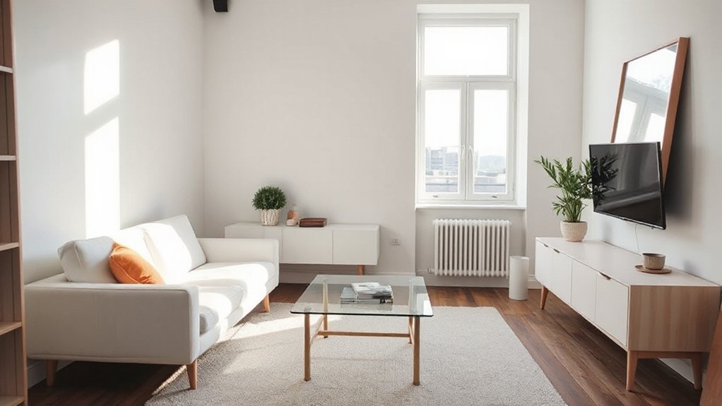
One-In, One-Out keeps your space lean by applying a simple rule: every new accessory requires the removal of one existing item. This approach tightens Accessory placement while maintaining function.
Start by cataloging current pieces that serve a clear purpose, then weigh potential additions against those needs. If you add a decorative object, remove a nonessential trinket orifice of clutter; if you add a storage item, ensure it replaces a similarly sized container you no longer use.
Prioritize items with visible utility or dual-purpose benefits to reduce surplus. Maintain a predictable rhythm: introduce one new piece, retire one old, repeat. This disciplined cycle minimizes visual noise, simplifies cleaning, and keeps sightlines clear.
The result: calmer spaces with deliberate, efficient clutter control.
Layered Lighting: How to Shape Space With Brightness and Depth
Layer brightness strategically to guide how you perceive space, using a mix of ambient, task, and accent lighting.
Layered lighting adds depth by creating contrasts in shadows and highlights, making surfaces read more three-dimensionally.
Start by mapping where you need visual emphasis and then place fixtures to balance light levels across zones.
Layer Brightness Strategically
To shape space effectively, you should layer brightness across different sources and intensities so no corner feels dim or flat.
- Combine ambient, task, and accent lighting to carve depth without glare.
- Use dimmers to vary brightness by room zone and time of day.
- Place lights to highlight focal areas, guiding color psychology cues.
- Don’t clash fixtures; choose consistent color temperature for cohesion.
- Align lighting with furniture placement to visually extend walls.
Aim for even distribution, then add purposeful shadows to define contours. Prioritize scalable, energy-efficient LEDs and avoid high-contrast hotspots. Balance warm and cool tones to affect mood and perceived space.
Test scenes with natural daylight first, then tweak artificial layers. This approach preserves practicality, avoids clutter, and supports precise, minimal renovations.
Depth Through Lighting Layers
Depth comes from how you stack light, not just how bright it is. You layer fixtures to carve space: a subtle uplight on walls, a tucked desk lamp for task clarity, and a ceiling wash to lift the center of a room.
Use warm to neutral color temperatures to preserve accuracy, then mix diffuse and directional beams to create contrast without glare. Place sources at different elevations and angles to generate deliberate shadow play that reveals architectural depth.
Keep lighting ambiance consistent by linking controls or dimmers, so you can shift mood without changing layout. Avoid over-illumination; selective brightness makes ceilings appear higher and corners more defined.
This layered approach gives perceptual depth while maintaining practicality and energy efficiency.
Small-Space Palettes: Color-Block by Room for Cohesion
Color-blocking by room simplifies small-space palettes and creates cohesion without visual clutter. You’ll pair color blocks with intentional balance, ensuring each room reads as a single story rather than a collage. Focus on color harmony across surfaces, textures, and accents, and align furniture scales to maintain proportion.
Use two to three core hues per area, with accent pops kept consistent door to door. Limit ceilings and floors to neutral anchors to amplify light and space. Choose finishes that reflect ambient light for depth without busy patterns.
- Define a core palette per room
- Match furniture scales to room size
- Repeat the same neutral base across zones
- Use a shared accent color sparingly
- Reserve bold hues for focal points
Sightlines and Flow: Rugs and Floor Plans That Guide the Eye
Rugs and floor plans shape how a space reads at a glance, guiding the eye to create logical sightlines and smooth movement. You’ll stage routes so you don’t trap traffic between furniture, and you’ll emphasize key zones with linear rug layouts that extend through open areas.
Use color contrast to delineate zones without walls; a lighter rug can pull a seating area forward, while a darker border grounds the room. Keep major walk paths clear and avoid oversized patterns that compete with focal points.
Place art at eye level along dominant sightlines to reinforce flow, ensuring pieces don’t interrupt movement. Map furniture offsets to window lines and doorways, aligning edges to reduce visual clutter.
This approach heightens perception of space and guides the eye efficiently.
Tidy Tech: Conceal Cables and Devices in Plain Sight
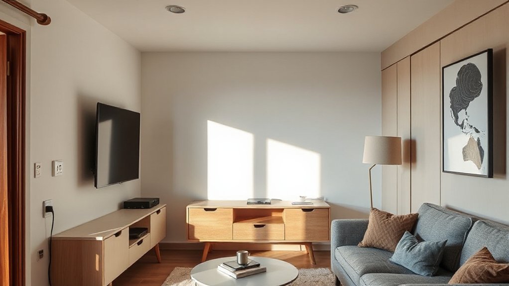
Hide cords, not clutter, by planning concealment right from the start. You’ll streamline setup with practical cable concealment and deliberate device integration, keeping surfaces clean and safe.
Plan routes behind furniture, under desks, or inside mounts to minimize visible tangles. Use low-profile raceways or fabric sleeves to blend with decor, and label cables for easy maintenance.
Choose wireless alternatives where possible to reduce connection clutter. Mount devices behind TVs or on walls to free surface space, then route power and HDMI cleanly to a single outlet.
Maintain ventilation by avoiding overcrowding. Regularly reassess layouts after upgrades to keep the system tidy and functional.
- Plan routing behind furniture and under desks
- Use low-profile raceways and fabric sleeves
- Label cables for maintenance
- Mount devices on walls or behind screens
- Prefer wireless options where feasible
Quick Accent Tricks That Read Bigger on a Budget
If you want a room to feel bigger without spending a lot, start with quick accent tricks that maximize perception of space. You’ll apply furnishing illusions by prioritizing scale: choose furniture that fits the room’s footprint, with low, slim profiles and exposed legs to create visual air.
Use vertical accents—tall bookcases, narrow storage, and wall-mounted cabinets—to pull the eye upward. Implement color psychology by selecting a cohesive palette: lighter tones on walls and contrasting darker accents for depth, avoiding heavy, saturated blocks.
Mirror strategically placed to double perceived size without bulky frames. Opt for unobtrusive lighting; recessed or track lighting reduces shadows, widening niches.
Keep clutter down and define focal points with a single bold accessory per zone to guide sightlines efficiently.
Seasonal Refreshes: Quick Updates That Don’t Renovate
Seasonal refreshes are about quick, low-effort updates that shift the room’s feel without a full renovation. You’ll leverage short-lived changes to test ideas, minimize cost, and keep spaces adaptable. Focus on impact over scope, using time-bound elements that reset with the season.
- Seasonal decor swaps to refresh focal points without moving major furniture
- Lightweight textiles and color accents that read as new without heavy commitments
- Layered lighting tweaks to alter mood and perceived space
- Clear, functional storage updates that declutter seasonal clutter
- Presence of scented cues and subtle greenery for a fresh, airy feel
Apply changes in 1–2 hours, document results, and revert if needed. This approach preserves flexibility while sharpening your flat’s perceived size. Seasonal decor and furniture swaps keep your space dynamic and efficient.
Renting Smart: Temporary, Reversible Tweaks for Tenants

As a renter, you can still shape a space’s feel with quick, non-permanent methods that won’t jeopardize your security deposit. To maximize perception of space, leverage renters’ decor cues and reversible arrangements that don’t alter walls or fixtures.
Use temporary layouts that delineate zones with freestanding screens, open shelving, or rugs, avoiding adhesive wall treatments. Choose modular furniture on casters or with slim footprints to reconfigure rooms as needed, and keep multi-purpose pieces close at hand.
Mirror placements should double lighting and depth without drilling; lean mirrors against walls or use over-door hooks for easy positioning. Lighting matters: layer task, ambient, and accent light to add vertical interest.
Label cords and protect surfaces with felt. Always document changes with photos for your records.
Daily Maintenance Checklists to Keep a Bigger Feel
Daily maintenance keeps a small flat feeling open by preventing clutter and visual noise from accumulating. A short, repeatable routine preserves space optimization and supports deliberate furniture arrangement, so you notice room to move rather than junk.
Set a quick three-step cadence: daily pickup, weekly wipe-down, monthly reassessment of layouts. Use a simple check to stay proactive and avoid build-up.
- Do a 5-minute surface declutter and tidy each evening
- Wipe high-traffic surfaces to maintain clean lines
- Review roommate or family items and reclaim shared zones
- Reassess furniture placement for flow and accessibility
- Schedule a monthly space and layout audit for optimization
Frequently Asked Questions
How Can I Measure Small-Space Impact Before Trying Changes?
You measure small-space impact by baselineing current readings, then testing furniture arrangement and lighting techniques. Use grid-free app or tape; track perceived width, brightness, and flow. Compare before/after; adjust, iterate, and document your precise gains.
Which Budget Tweaks Yield the Biggest Perceived Space Gain?
You’ll gain about 20% perceived space by smart Furniture arrangement and subtle Lighting enhancements. You’ll optimize flow, avoid clutter, and use mirrors to bounce light, making rooms feel larger. Prioritize verticals, multi-functional pieces, and cohesive color for efficiency.
Can Plants Actually Influence Room Perception and Humidity?
Plants do influence perception and humidity: they improve Indoor air quality and create subtle Visual illusions of space through layered textures and vertical growth. You’ll notice cooler, cleaner air and calmer rooms as humidity stabilizes.
What Temporary Decluttering Steps Save the Most Time?
You minimize clutter with a timer, then tackle quick passes like returning items to their places. Use furniture arrangement to open sightlines and lighting techniques to brighten corners, saving time and reducing perceived space instantly.
Are There Risks With Bold Color Blocks in Tiny Rooms?
Yes—bold color blocks can feel risky in tiny rooms if you overwhelm walls or clash with lighting. Use Bold accents sparingly and rely on Color psychology to balance mood, scale, and visible flow, maintaining cohesion and occupancy comfort.
Conclusion
You’ve got the moves to fool the eye and stretch every inch. Imagine this: a corridor of calm, light bouncing off slick surfaces, a hidden shelf sliding into place, and a window that glows at dusk. As you apply one more practical tweak—layered lighting, a clever mirror angle, a portable storage trick—the space reveals its true potential. The door locks, the room feels larger, and you’ll wonder why you waited. What hidden trick will you try next?