
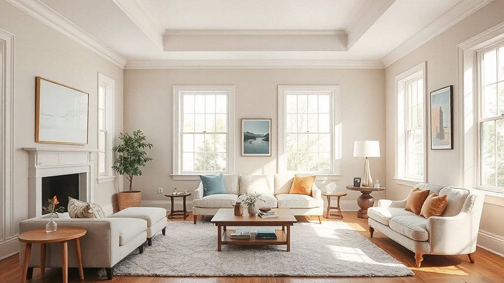

You might worry north-facing rooms can never feel bright, but the right warm neutrals can bounce light without turning yellow. Start with creamy taupes or soft creams with peach undertones, then layer sunny accents to lift the space. Finish with satin or eggshell to boost reflectivity, and test large swatches under morning and afternoon light to confirm harmony. Curious how these choices play out in real rooms? Keep going to see practical steps and quick-start options.
Why North-Facing Rooms Feel Dim and How Color Helps
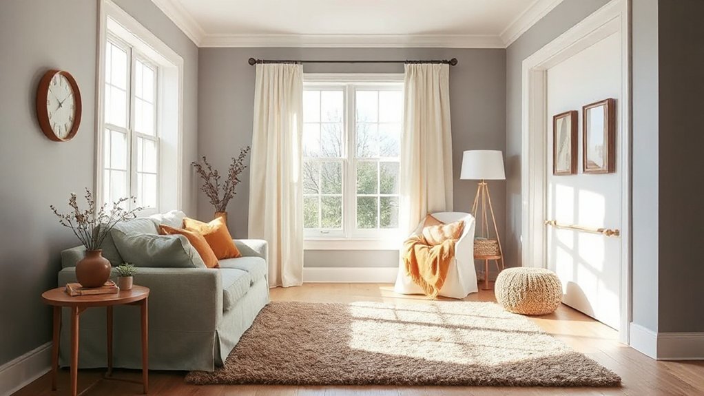
North-facing rooms often feel dim because they receive less direct sunlight, so the color you choose can make a big difference. You’ll maximize brightness by aligning your approach with lighting angles and furniture placement.
Use cool whites or pale warm neutrals that reflect light without washing out details. Position lamps and wall sconces to mimic natural light, aiming for layered illumination that eliminates shadows in corners.
Mirror placement matters; place mirrors opposite windows to bounce daylight deeper into the room. Keep furniture off walls or stagger pieces to avoid blocking light paths, creating a sense of openness.
Consider semi-gloss or satin finishes on walls to catch and scatter light without glare. Test swatches in multiple hours to confirm under your specific daylight.
Choose a Bright Core Palette: Warm Neutrals That Brighten North Light
Choose a bright core palette built on warm neutrals that reflect and brighten north light. Start with a core set of warm neutrals that pair well with cool northern illumination, then test them in multiple zones to verify glow.
Use practical contrasts and consistent undertones to keep rooms feeling airy, cohesive, and energized.
Warm Neutrals Brighten North Light
To brighten a north-facing room, start with a core palette of warm neutrals that reflect and amplify the available light. Choose shades that read as warm, not yellowy, and balance saturation with hue. This core supports color psychology by eliciting perception of warmth and openness, even in dim corners.
Prioritize paint durability with flat or eggshell finishes that resist washings and maintain tone.
- Soft cream with a peach undertone, brightening walls without overpowering furniture.
- Warm beige that reads as cozy, enhances texture, and stays stable in indirect light.
- Toffee-tawn, a midtone that adds depth while remaining luminous.
- Creamy taupe, a versatile anchor that pairs with wood and textiles.
These picks maximize light, clarity, and durability for long-term serenity.
Core Palette For North-Facing Rooms
A bright core palette for north-facing rooms centers on warm neutrals that reflect available light without skewing yellow. You’ll choose tones that read airy rather than flat, balancing warmth with clarity.
Start with a base of soft warm whites or beige-tinged neutrals that won’t drift cool under northern light, then layer with slightly richer sand or taupe accents for depth. Use one or two brighter whites for trim to sharpen edges and keep you from washing out corners.
Consider how Historical color trends inform your choices, favoring timeless warmth over flashy contrasts. Cultural color symbolism can guide accents—earthy tones feel grounded, while muted apricots or blushes add subtle cheer.
Apply swatches in multiple rooms to ensure consistent brightness across surfaces and lighting conditions.
Brightening Techniques With Warm Tones
To brighten north-facing rooms, start with a warm neutral core and introduce targeted tonal boosts that reflect light without pulling toward yellow. You’ll balance color psychology with practical tweaks, choosing hues that feel airy yet grounded, and you’ll test swatches on multiple walls to confirm brightness under consistent daylight.
- Build a calm base with warm taupes or greiges that resist yellow bias, ensuring paint durability under daily use.
- Add lighter accents in peachy-ivory or warm almond to lift shadows without skewing warm.
- Introduce selective depth at trim or furniture edges to guide the eye and maintain contrast.
- Choose satin or eggshell sheens for easy cleaning and sustained luminosity without glare.
White With Warmth: Ceiling-to-Trim Choices That Read Cozy
When you pair ceiling and wall tones, start with a warm white that keeps north-facing light from feeling flat.
Match your trim finish temperature to the overall mood—cool whites for crisp contrast or warm whites for cozy continuity.
Keep the ceiling-wall-Trim trio cohesive by testing a few samples side by side to confirm the read from eye level to crown molding.
Ceiling-Wall Tone Pairings
Ceilings that read warm can instantly cozy up a north-facing room, especially when you pair a soft, warm white with a slightly richer trim. Here’s how to choose ceiling–wall pairings that feel welcoming and purposeful.
- Opt for a warm white on the ceiling, with a slightly darker wall tone to amplify contrast and keep ceiling height feeling balanced.
- Use an off-white on walls near an accent wall to create depth without shrinking the space.
- Balance matte ceilings with satin walls to reflect light while preserving warmth.
- Tie in an accent wall color at a focal point to guide the eye and enhance perceived ceiling height.
Trim Finish Temperature
Ever wonder how trim finish temperature can tilt a north-facing room from flat to inviting? You’ll gain warmth by choosing trims with slightly warmer undertones than the ceiling and walls. Start with a base white that reads clean, then add a hint of ivory or cream in the trim to create depth without shouting.
Keep ceiling-to-trim contrast modest; too stark reads clinical, not cozy. When selecting paint, consider the undertone under north light—warm whites reduce cool cast and lift shadows.
Paint application techniques matter: use consistent, even coats, and finish with a fine-sanded edge to blur *gradations*. Test swatches on both wall and trim near lighting sources at different times of day. Document your results, then finalize with two thin coats and a durable enamel for trim.
Light-Reflecting Yellows and Beiges for Instant Glow
Light-reflecting yellows and beiges brighten north-facing rooms instantly by bouncing natural light around the space. You’ll choose tones with warm undertones to lift mood and perception of space, applying color psychology to guide mood while preserving practicality.
Prioritize paints with solid coverage and durable finishes to avoid frequent touch-ups, boosting long-term paint durability.
- Imagine pale saffron walls that wash the room in soft sunshine, accentuating trim and furniture.
- Picture creamy beige tones reflecting daylight, rendering corners brighter without glare.
- Visualize honeyed hues that emphasize architectural features and create warmth on gray days.
- Envision warm almond or biscuit shades that stay true after washings and cleaning, maintaining consistency.
Tip: test swatches on multiple walls and check finish durability under humidity and cleaning.
Subtle Greens and Blues That Bounce Light Without Cooling

Try subtle green accents and light-reflective blues to brighten your north-facing room without cooling it. Choose greens with a warm undertone and blues that reflect light, not absorb it, so the space feels lifted.
Start with small swatches on feature walls or trims to gauge bounce and balance with existing furniture and accents.
Subtle Green Accents
- Paint an accent wall in a soft sage mixed with white for airiness and subtle warmth.
- Introduce accessories in avocado or pistachio tones to cue sunlight across surfaces.
- Pair with light-wood frames and textiles that echo green highlights for cohesive texture.
- Opt for eco-friendly pigments and breathable finishes to maintain indoor air quality while nodding to historical color trends. Focus on balance, not saturation, for lasting brightness.
Light-Reflective Blues
Could you brighten a north-facing room with blues that bounce light without cooling the space? Choose light-reflective blues near the white or pale gray family, preferably with a LRV around 60–70.
Opt for soft, airy tones like periwinkle, powder blue, or icy steel, which maximize daylight without feeling chilly. Apply matte or eggshell finishes to reduce glare, then pair with bright white trim to enhance contrast.
Use a warm, neutral undertone to prevent a sterile look, and test swatches on two walls at different times of day to confirm bounce.
Color psychology suggests blues can feel calm yet uplifting when balanced with natural textures.
Prioritize paint durability by selecting premium brands and proper surface prep to prevent peeling or fading over time.
Sunny Accent Colors That Complement North Light

When your north-facing room lacks natural warmth, choose sunny accent colors that brighten without overpowering the space. You want hues that read as sunlit without stealing focus, so pick warm, medium-saturation tones. Think softly radiant yellows, light apricots, and pale corals that reflect the available light.
These accents should pair with cool neutrals to maintain balance and avoid glare. Consider colors that feel approachable and timeless, ensuring your walls still read spacious. Sunlit garden-inspired notes can be introduced in accessories, fabrics, and furniture cushions, creating a cohesive flow.
For durability, factor how color holds with time and cleaning. Pick variants with solid pigment load to prevent fading.
- Butter egg yolk yellow accents
- Soft apricot cushions against cool gray
- Warm coral throw pillows
- Sunlit garden-inspired wall art
Finishes and Sheens: How Gloss, Satin, or Eggshell Boost Brightness
Glossy, satin, and eggshell sheens each play a distinct role in brightening a north-facing room. You should pick a gloss level that reflects the amount of light you want to bounce, with gloss delivering the most sheen for high-contrast drapes and trim.
Satin offers a balanced mid-tone finish, keeping surfaces brighter without glare, ideal for walls in busy spaces. Eggshell softens brightness while still staying cleanable and durable for high-traffic areas.
When applying, guarantee even coats and proper surface prep for true brightness. Consider eco-friendly finishes to minimize odor and volatile chemicals, yet still maintain paint durability.
For durability in busy areas, favor mid to high solids without sacrificing brightness, and test samples on walls before committing.
Room-by-Room Color Plan for Pockets of North Light
North-facing rooms collect gentler, cooler light, so tailor color plans room by room to catch the best pockets of sun. You’ll map each space to maximize interior lighting benefits and preserve paint durability over time.
- Entry niche: pick warm neutrals with high undertone clarity to bounce light without washing shadows.
- Living zone: choose mid-tone walls near windows, accented with brighter trims to create contrast and depth.
- Kitchen alcove: select moisture-friendly finishes in light, reflective colors to brighten work surfaces.
- Homework nook: optimize with cool, low-saturation hues that reduce glare while maintaining readability.
Implementation tips: pair colors with appropriate sheen, test near windows, and avoid overly saturated shades that strain interior lighting.
Practical Testing: How to Test Paint in Your Space Before Committing

Testing paint in your space before committing saves time, money, and headache. Start with a controlled swatch process: paint small test patches on large cardboard or wall sections that mimic your actual wall surface, then observe at different times of day.
Use 2–3 neutral bases and 1 accent hue to compare warmth, brightness, and undertones. Label each patch clearly and photograph them under natural light and artificial lighting.
Assess color psychology effects—how mood shifts with each shade—and jot notes on perceived warmth or coolness.
Apply clean, consistent paint application techniques: prime, sand lightly, and use uniform coats for an honest read.
Move patches around, rotate samples weekly, and wash surfaces between tests to prevent residue bias.
Finalize after daylight, sunset, and lamp-lit reviews.
Real-Life North-Facing Makeovers: Before and After
When a north-facing room divides light into cool, dim tones, small changes can produce a noticeably brighter, more inviting space. Real-life makeovers show you practical, repeatable steps that work.
- Lighten walls with warm, high-durability neutrals to shift temperature and boost perceived brightness.
- Introduce a matte ceiling in a lighter shade to reflect more light without glare.
- Add strategic accent colors rooted in color psychology to influence mood and perceived space.
- Prioritize durable, washable finishes on trim and surfaces to maintain brightness after daily wear.
These cases prove you can transform mood and space without overhauling furniture. Focus on color psychology for impact, and choose paint with high durability to keep the look fresh over time.
Quick-Start Color Framework: A Ready-to-Use 3-Palette System
To brighten a north-facing room quickly, adopt a ready-to-use 3-palette system that covers walls, ceilings, and accents with intentionally chosen tones. This framework keeps decisions fast and consistent: Palette A lightens walls with a warm white, Palette B adds depth on ceilings or an accent wall, and Palette C delivers contrast through trims and textiles.
Use color psychology to align moods—gentle off-whites for calm, brighter neutrals for energy, and a soft accent for focus. Apply paint durability principles by selecting low-VOC, scrubbable finishes in high-traffic areas and semi-gloss on trims for cleanability.
Map lighting first, then assign palettes to zones to minimize glare and shadows. Revisit saturation sparingly; adjust with accessories rather than wholesale repaint. This system yields reliable, repeatable results.
Frequently Asked Questions
How Long Does Paint Color Last in North-Facing Rooms?
Paint color in north-facing rooms lasts about 5–10 years, depending on quality and exposure; you’ll notice color fading or dulling as it ages. For durable results, choose high-quality finishes, proper prep, and regular cleaning to preserve paint durability.
Can I Use Bold Colors Without Making the Room Feel Smaller?
Bold colors can work; you’ll just balance them with bright neutrals and ample lighting. You see color psychology at play, and use interior accents to prevent shrinking the space while keeping your north-facing room lively and focused.
Do Window Treatments Affect Color Brightness in North Light?
Yes, window coverings affect brightness in north light. Use light-filtering options to diffuse daylight, reducing harsh contrasts while maintaining color accuracy. Choose breathable fabrics, soft neutrals, and avoid heavy drapes that block illumination.
What Lighting Should I Pair With Cool-Toned Paints?
Use cool-toned paints with balanced Lighting options, then pick paint finish choices like eggshell or satin for soft reflections. Pair brighter LED bulbs, dimmable warm-cits, and task lighting to avoid flatness and keep color true in north light.
How to Test Colors on Multiple Walls at Once?
You can test colors on multiple walls by using color swatch testing with large wall sample placements across surfaces, then compare. Start with a neutral base, rotate samples, and document notes to avoid misreading shade shifts.
Conclusion
You’ll notice the glow when you test big swatches at different times of day, exactly where the sun lingers. Coincidence nudges your choices: a warm neutral might align with the trim you already own, or a sunny accent echoes the lamp you love. Trust that the right cream, beige, or gentle peach will bounce light back. Pick a palette, apply boldly, and adjust only as needed—brightness follows your practical, precise refinements.