
What’s the Deal with Bedroom Colors?
You might think your mattress or blackout curtains do all the heavy lifting for sleep, but color quietly runs the show in the background. Studies from sleep foundations routinely point to soft blues, greens, and neutrals as top performers for deeper rest, while hot, high-energy tones like vivid red can increase heart rate and alertness. When you start treating your walls, bedding, and decor as part of your sleep toolkit, suddenly the shades you pick feel a lot less random and a lot more intentional.
Why Colors Matter More Than You Think
Most of your brain is processing color and light long before you realize you “like” a shade, which is why a slightly too-bright yellow can feel jittery at 10 p.m. While cool hues have been linked to lower blood pressure and slower breathing, saturated warm tones tend to cue your brain that it’s go-time. Even the difference between a soft gray-blue and a pure bright blue can shift your bedroom from spa-like to chilly or clinical in seconds.
The Psychology Behind Color Choices
Your color preferences aren’t just about taste, they’re tied to memories, culture, and even your daily stress levels. You might crave green because you associate it with quiet hikes, while someone else feels safest wrapped in warm beige. That emotional wiring is exactly why certain palettes help you relax faster at night and others keep your mind buzzing, even if the room technically “looks” stylish.
Researchers have found that people sleeping in blue bedrooms logged nearly 2 extra hours of rest per night compared with those in purple rooms, which is wild when you think about it. What that tells you is simple: your nervous system reads color like a language. Soft blues, greens, lilacs, and off-whites usually whisper “it’s safe, unwind,” while high-contrast schemes or loud accent walls can feel like visual noise. So when you’re picking a palette, you’re not just picking paint, you’re picking how you want your body to feel every night.
How to Find Your Own Color Vibe
Instead of starting with a paint deck, start with your life: where do you actually feel most relaxed – in nature, at a spa, in a cozy cafe? Then pull colors from that scene. If you love beach trips, that might mean sandy beige, soft blue, and warm white; if forests are your thing, try mossy greens with muted browns in small doses. The more your bedroom echoes your happiest places, the more naturally your brain will downshift at night.
A quick way to nail this is to scroll your camera roll and screenshot 5 photos where you felt genuinely calm, then use free color picker tools to grab the dominant shades. You might notice a pattern: maybe it’s all dusty blues and warm creams, or maybe it’s terracotta accents against soft white. From there, assign one color to walls, one to textiles, and one to small accents so your “vibe” turns into an actual, livable palette instead of just a mood in your head.
My Top Color Combos for a Relaxing Bedroom
Up to 62% of people say their bedroom color affects how well they sleep, so pairing hues strategically lets you double down on calm. When you mix soft, low-contrast shades like muted blues, grays, greens, creams, and blush tones, you create a space your nervous system can actually exhale in. Think layered textures, quiet patterns, and lighting around 2700K to 3000K so your carefully chosen palette stays soothing day and night.
Blue and Gray – A Match Made in Heaven
Studies often rank blue bedrooms as the most restful, and when you layer in light gray, you soften the whole look instantly. You could paint your walls a pale sky blue, then bring in a cool gray upholstered headboard, textured gray throw, and soft blue linen bedding. This combo works especially well if you like a modern or coastal vibe, because it still feels calm but not the least bit boring.
Soft Pink and Cream – Sweet Serenity
Sleep surveys regularly show that softer, warmer palettes make you unwind faster, and soft pink with creamy neutrals is one of the easiest ways to get that effect. You might try a barely-there blush on the walls, cream bedding, and a rose-toned throw at the foot of your bed. The result is cozy, flattering, and quietly romantic without tipping into overly girly territory.
With soft pink and cream, you get a combo that flatters your skin tone and your space at the same time, so your bedroom actually feels like a little retreat. You can keep walls light and muted, then build depth with a cream headboard, pink velvet accent cushions, and maybe a patterned rug that mixes blush, beige, and a touch of warm gray. If you’re nervous about pink, start small with artwork, throw pillows, or a quilt, then slowly layer more in as you fall in love with how gentle and calm the room feels at night.
Green and Beige – Nature’s Embrace
Biophilic design research shows that even just seeing green tones can lower stress levels, so pairing soft green with beige instantly gives your bedroom a nature-inspired feel. You could go for sage walls, a warm beige duvet, and woven jute or rattan accents to echo natural materials. This duo is perfect if you want your space to feel grounded and organic but still clean and pulled together.
When you lean into green and beige, you’re basically borrowing the calm of a forest and dropping it right into your bedroom. Try a soft sage or eucalyptus green on the walls, then anchor the room with a beige upholstered bed, oatmeal linen curtains, and maybe a chunky knit throw in a slightly deeper tan. Add in real plants, a woven basket or two, and artwork with botanical prints, and suddenly your room feels like a quiet cabin escape even if you’re smack in the middle of the city.
Seriously, Have You Tried the Bold Looks?
Lately, designers on Instagram and Pinterest have been leaning hard into richer palettes for bedrooms, proving you can still sleep beautifully in a moodier space. When you anchor your room with one strong color combo, then soften it with texture, lighting, and a few airy accents, you get that boutique-hotel vibe without sacrificing calm. Bold doesn’t mean chaotic – it just means your bedroom actually looks finished and intentional.
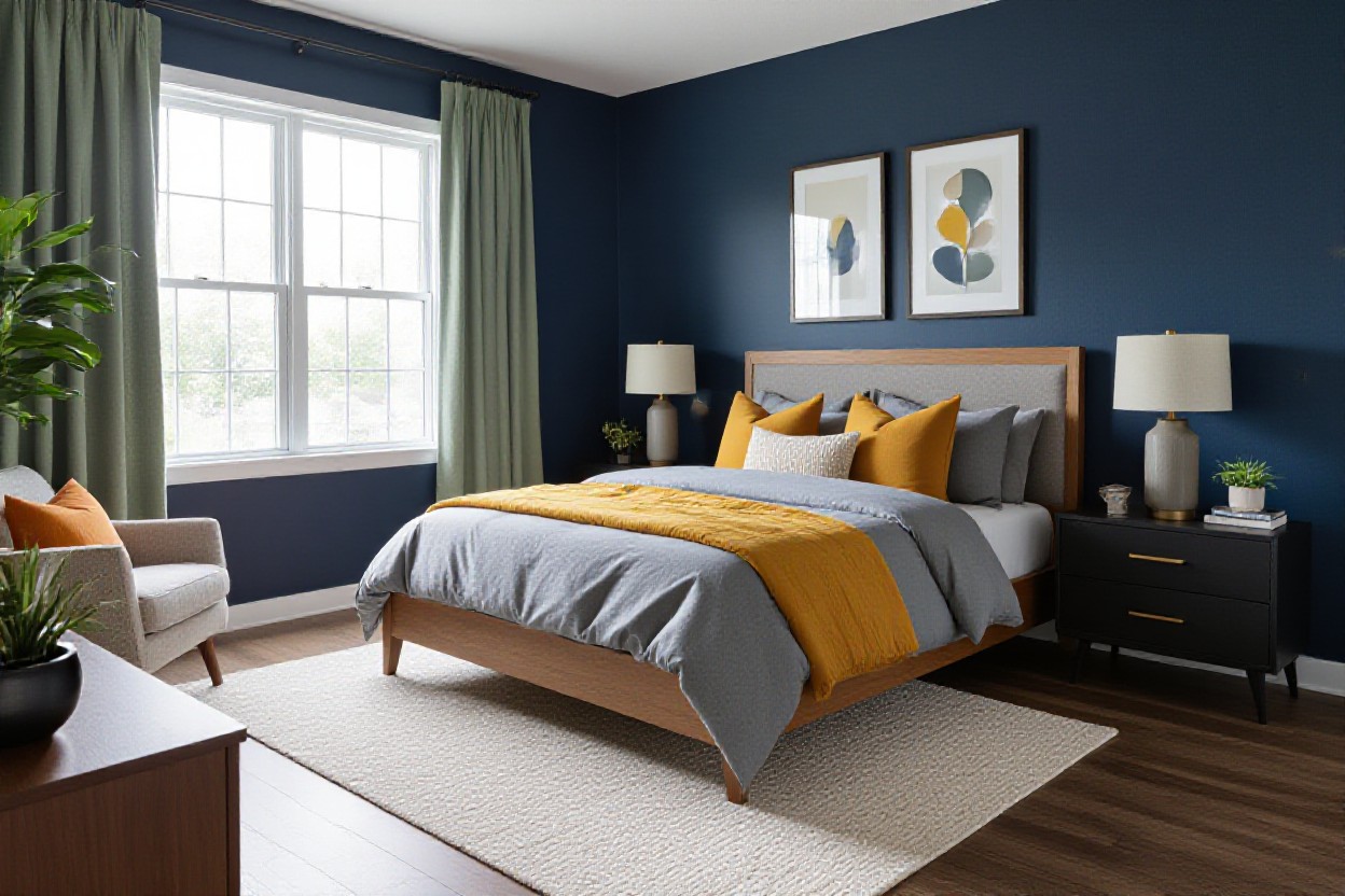
Deep Teal and Mustard – A Touch of Drama
Deep teal and mustard work like a power couple in your bedroom, giving you drama without feeling loud. You might paint an accent wall in a rich teal (LRV around 10-15) and then layer in mustard pillows, a throw, or even a velvet bench to break up the depth. With warm wood, soft white bedding, and dimmable bedside lamps, the combo feels cozy, cocoon-like, and surprisingly relaxing at night.
Charcoal and Blush – Chic Sophistication
Charcoal and blush are basically the grown-up version of pink and gray, and they instantly make your bedroom feel styled. You could go with charcoal on the headboard wall, then weave in blush through linen bedding, artwork, or a rug so it softens the darkness instead of competing with it. Add warm white lighting at 2700K and a couple of brass accents, and you’ve got that subtle, hotel-level polish.
Because charcoal can swallow light, you’ll want to balance it with plenty of soft surfaces so the room doesn’t feel flat. Try layering textures: a chunky blush knit throw, gauzy curtains, maybe a tweed or boucle upholstered bench at the foot of your bed. If your room is small, keep ceilings and trim crisp white so the charcoal feels like a backdrop, not a cave. Even swapping in blush-shaded lamps or art with blush undertones can tie the palette together without a full redesign.
Navy and Gold – Luxurious Touches
Navy and gold give you that quiet luxury look that’s been blowing up in 5-star hotel suites and high-end show homes. You might use navy on the walls or upholstered headboard, then sprinkle in gold through hardware, picture frames, and slim bedside lamps so it feels elevated, not flashy. With layered lighting, off-white bedding, and maybe a patterned navy rug, the space feels rich, tailored, and still totally restful.
So if you lean into navy and gold, treat navy like your new neutral and let gold act as the jewelry in the room. You can keep big pieces simple – think plain navy duvet, clean-lined nightstands – then add gold in smaller hits like curtain rods, mirror frames, or even a thin gold stripe in your throw pillows. If you’re worried about it feeling too formal, bring in a bit of natural texture like a jute rug or oak nightstands to relax the look and make it feel livable, not staged.
Light Colors that Actually Open Up Space
Studies using light reflectance value (LRV) show that shades above 60 can visually expand a room, so when you lean into soft, light colors your bedroom instantly feels bigger and airier. You’re basically tricking the eye into reading more depth, less clutter, and smoother transitions between walls, ceiling, and floor. Pairing these high-LRV tones with simple lines, minimal contrast, and a few well-placed mirrors lets you stretch every inch of square footage, even in a small city bedroom.
White and Light Wood – Crisp and Clean
Research from the paint industry shows that bright whites can reflect up to 80 percent of natural light, and when you mix that with light oak or birch furniture your bedroom suddenly feels twice as open. You get this crisp, Scandi-inspired vibe that’s clean but not cold, especially if you layer in woven baskets, a chunky knit throw, or linen bedding. If your room is small or north-facing, this combo helps you grab every bit of brightness you can.
Pastel Colors – Subtle Yet Stylish
Soft pastels like powder blue, blush, or mint usually sit in the 60-70 LRV range, so they bounce light but still add a hint of personality to your bedroom. You get a space that feels airy without being stark, especially when you pair pastel walls with white trim and neutral bedding. If you’re nervous about bold color, this is your low-risk way to make your room feel styled, not sterile.
Pastel colors work especially well in small bedrooms or guest rooms where you want calm energy without going full beige. You could try a pale blue-green on the walls, keep your bedding white, then repeat that same pastel in a throw pillow or piece of art so the whole room feels intentional. Because these hues are so soft, you can mix a couple of them – like blush and dove blue – and it still feels cohesive. And if you ever change your mind, they’re easy to paint over compared to stronger, saturated shades.
Soft Lavender and White – Calming Vibes
Color psychology studies often link lavender with reduced stress and lower heart rates, so using a soft lavender paired with white can turn your bedroom into a genuinely soothing retreat. You get a light, airy look that still feels a bit luxurious, especially if you bring in textured white bedding and maybe a lilac throw or two. This combo is great if you like a hint of color but still want your room to feel bright, clean, and not overly feminine.
Soft lavender and white really shine in rooms where you wind down after long, tech-heavy days, because the cool undertones help counteract visual fatigue from screens. You might paint just the headboard wall lavender, keep the rest white, and then echo that purple tone in a ceramic lamp or artwork so the color feels grounded, not floaty. Warm metals like brushed brass or soft gold bedside lamps stop the scheme from reading too cold. And if your space only gets moderate natural light, a very pale lavender with white trim will still keep everything feeling open rather than cave-like.
What Colors Work Best for Different Styles?
Different bedroom styles actually behave like filters for color – the same gray can feel ultra-luxe in one room and totally flat in another. When you lock in your style first, you can narrow your palette fast: a modern minimalist space might use 2 or 3 hues max, while a boho room can happily juggle 6 or more without feeling chaotic. So as you read through these styles, picture your existing furniture, flooring, and lighting, then plug color combos in like puzzle pieces.
Modern Minimalism – Keep It Simple
For a minimalist bedroom that still feels warm, you do best with a tight palette: soft white walls, light gray bedding, and one accent like muted tan or greige. Studies on visual clutter show your brain relaxes when it processes fewer contrasts, so you want low-contrast combos, not stark black and white. Add just one darker tone, maybe charcoal on a throw or bed frame, to ground the room without killing that airy, gallery-like vibe.
Bohemian Charm – Mix and Match
Boho style actually comes to life when you stop worrying about perfect matches and start thinking in families of color: warm terracotta, mustard, dusty pink, deep teal, all layered over a creamy base. You can pull 4 to 6 colors from a single patterned rug or quilt and repeat them in pillows, art, and throws so it feels collected, not chaotic. The trick is keeping at least 60 percent of the room in softer, low-saturation shades.
With a boho bedroom, you can lean into richer pigments without making the space feel busy, as long as you anchor everything with a calm backdrop like off-white or pale sand. So you might paint the walls a light oatmeal, bring in a kilim rug with rust, olive, and indigo, then echo those tones in linen pillows and a velvet throw. Because each hue shows up at least three times, your eye reads it as intentional layering rather than random color chaos, which is exactly why boho rooms in design magazines look curated instead of messy.
Rustic Relics – Earthy Tones
Rustic bedrooms really shine when you lean into colors you’d actually find outside: warm browns, soft clay, muted sage, and creamy whites. If you already have wood beams or a timber bed, you can balance that visual weight with lighter walls around LRV 65, like warm ivory or pale greige. Add depth with a darker olive quilt or chocolate throw at the foot of the bed so the space feels grounded, not washed out.
In a rustic space, your color story works hardest when it ties directly to the wood tones in the room, otherwise everything can start to clash or feel too orange. You might pair cool knotty pine with a smoky blue-gray wall and stone-colored linen, or match rich walnut furniture with caramel accents and a soft moss green duvet. Because you’re echoing the natural variation in the wood grain, the whole room reads as cohesive and relaxed, like a cabin that evolved over decades, not something thrown together in a weekend.
Let’s Talk About Accent Colors – What’s the Real Deal?
Accent colors are your shortcut to a bedroom that looks styled, not random. You can keep your walls calm with soft blues or neutrals, then drop in 10 to 20 percent of a bolder color through decor so the room feels layered instead of flat. By repeating that accent 3 to 5 times – in pillows, art, maybe a throw – you create a pulled-together look that feels intentional without repainting a single wall.
Throw Pillows and Rugs – Little Pops of Color
Throw pillows and rugs are where you can play a bit wild without long-term commitment. You might pair pale green walls with rust and oatmeal pillows, then tie it together with a rug that has just a hint of that same rust. Because these pieces are smaller, you can test trends like terracotta, ochre, or dusty mauve for a season, then swap them out when you want a new vibe without blowing your whole budget.
Artwork – Infusing Personality into Your Space
Artwork quietly controls your color story more than you think. When you pick a piece with 2 to 3 key shades that echo your bedding or pillows, your bedroom suddenly looks curated instead of pieced together. You could hang a large coastal print above your bed to pull in soft blues, or a minimal abstract to repeat smoky grays – either way, your art acts as the color anchor.
With artwork, you’re not just filling empty wall space, you’re setting the mood every time you walk in. You might choose a pair of 18 by 24 prints that mirror your accent colors, then repeat one subtle hue from the art in a throw blanket at the foot of the bed so everything talks to each other. Framing matters too: a black frame instantly sharpens a light gray scheme, while oak or white frames keep a soft neutral room feeling airy. If you’re nervous about color, pick mostly calm pieces with just a small hit of your bold shade so the room still feels restful, not chaotic.
Curtains and Bedding – It’s All About Coordination
Curtains and bedding are the big color blocks in your bedroom, so they can either fight each other or work as a team. If your walls are pale blue, you might go for warm white curtains and a blue-and-sand duvet to keep things serene. You usually want one dominant color (around 60 percent), one supporting color (about 30 percent), then a 10 percent accent so the whole setup feels balanced and not like a fabric store exploded.
When you dial in curtains and bedding, everything else in the room suddenly feels easier. You could start with a solid linen duvet in a soft neutral, then let your curtains echo that shade within 1 or 2 tones so the room feels cohesive when the light hits. Patterns work best when at least one color overlaps – for example, striped curtains sharing the same warm beige that runs through your quilt. If you love darker bedding, soften it with lighter curtains so the room still feels open, and always check how the fabrics look in both morning and evening light before you commit.
The Colors to Avoid If You Want Peace
With soft, muted palettes trending on Pinterest and Instagram, anything overly loud or chaotic in a bedroom sticks out like a sore thumb. You might love bold color in your living room, but in a sleep space it can spike alertness, raise your heart rate, and even delay melatonin production according to several sleep studies. So instead of chasing drama, you want to sidestep a handful of shades and combinations that quietly chip away at that calm, cocoon-like vibe you’re trying to create.
Harsh Reds and Bright Yellows – Too Much Energy
High-octane reds and traffic-light yellows pump up your brain the same way a double espresso does, which is fun in a kitchen or workout room but not when you’re trying to unwind. Research on color and heart rate shows red can literally make your pulse quicken, and strong yellow is linked to overstimulation and irritability. If you adore these shades, keep them tiny – a single cushion, a stripe in the art – and anchor them with cool blues, greens, or soft neutrals so they don’t hijack your whole bedroom.
Dark Colors – Can They Really Make Things Feel Smaller?
Deep navy, charcoal, and chocolate brown can look incredibly chic, but in a compact or poorly lit bedroom they tend to swallow light and visually shrink the walls. You’ll notice corners feel heavier, the ceiling seems lower, and your eye doesn’t travel as easily around the space. Dark pigment absorbs more light than it reflects, so instead of a calm cocoon, you can wind up with a cave-like box that feels more cramped than cozy.
In practice, you’ve probably seen this play out in photos: that moody all-navy bedroom that looks amazing in a magazine is usually shot in a huge room with floor-to-ceiling windows and pro lighting. In an average 10-by-12 bedroom with one small window, the same color on every wall can cut the perceived size dramatically and make you rely on lamps all day. You can still use dark tones smartly though – try one accent wall behind the bed, darker upholstery, or a charcoal headboard paired with soft white walls, light flooring, and reflective surfaces like mirrors so you keep the drama without losing the sense of space.
Too Many Clashing Colors – Keep It Cohesive
Throwing five or six competing colors into a single bedroom might look playful on a mood board, but in real life it usually reads as visual noise. When every surface fights for attention, your brain has no clear place to rest, which quietly raises mental fatigue and makes it harder to wind down. Sticking to 3 main hues – a dominant, a secondary, and one accent – instantly feels calmer, even if those colors are strong.
On actual projects, you can see this difference side by side: a room with teal walls, bright red bedding, yellow curtains, and bold patterned rugs has your eye ping-ponging everywhere, while the same teal walls paired with layered neutrals and one accent shade feel intentionally designed. If you love color, channel it into one family – like varying shades of blue-green or warm earthy tones – then repeat those same hues in your bedding, artwork, and decor. Because your palette is limited and repeated, your brain reads it as organized instead of chaotic, and that sense of cohesion alone makes your bedroom feel instantly more peaceful.
Is There a Science to Choosing Colors?
Think about how a spa lobby instantly chills you out while a fast-food place kind of ramps you up – that’s not by accident. You’re tapping into color psychology, circadian rhythms, and even heart-rate responses without realizing it. Studies from places like the University of Manchester show that certain wavelengths of light and color can impact melatonin, so the colors you choose at home genuinely affect how easily you wind down, how spacious your room feels, and even how early you wake up.
The Color Wheel – Your New Best Friend
Picture the last time you saw a perfectly styled bedroom on Pinterest and thought, why does that combo just work? That’s the color wheel quietly doing its thing. When you use simple rules – like pairing opposites (blue and orange), neighbors (blue and teal), or a trio at equal distances – you get color combinations that feel intentional instead of random. It helps you mix your wall color with bedding, art, and rugs so everything looks curated, not cluttered.
The Role of Lighting – Seriously, It Matters
Walk into your bedroom at 8 am, then again at 8 pm, and it almost feels like two different paint colors, right? That shift is pure lighting magic. Natural light, bulb type, and even window direction all tweak how your colors show up, which is why a perfect soft gray in the store can look oddly purple in your space. When you test colors in morning, midday, and evening light, you’re basically doing a mini design experiment in real time.
You might have noticed how north-facing rooms often feel a bit cooler and shadowy, even with white walls, while south-facing ones look naturally golden – that difference can totally make or break your palette. In a darker bedroom, deep navy can suddenly feel like a cave, but in a bright, sun-soaked space, it looks sophisticated and calm. And when you layer lighting – overhead, bedside, maybe a floor lamp – at around 2700K to 3000K, you soften shadows and make your colors feel warmer, cozier, and a lot more flattering at night.
Color Temperature – Warm vs. Cool
Think of warm vs cool colors like choosing between a cozy cabin and a breezy beach house for your bedroom vibe. Warm tones (beige, terracotta, blush) pull the walls visually closer, so the room feels snug and intimate, while cool hues (blue, green, soft gray) tend to recede and make the space feel calmer and a bit larger. When you mix them intentionally, you get a room that feels restful but not flat, like pairing a cool blue wall with warm wood nightstands.
| Warm Color Temperature | Cool Color Temperature |
|---|---|
| Includes shades like soft beige, cream, peach, muted terracotta that mimic candlelight and sunsets. | Covers tones like blue, sage, aqua, and light gray that visually recede and feel airy. |
| Makes large bedrooms feel cozier, especially in spaces with high ceilings or minimal furniture. | Helps small or low-ceiling rooms feel wider and more open, especially in tight city apartments. |
| Pairs well with warm bulbs (around 2700K) to create a relaxing, cocoon-like atmosphere at night. | Works beautifully with cooler daylight or east-facing light for a crisp, refreshing morning feel. |
Once you start paying attention to color temperature, you notice how quickly your room can shift from soothing to slightly off just by leaning too hard in one direction. All-warm can feel heavy in a small space, while all-cool can slide into sterile, especially if you’ve got white LED bulbs blasting at 4000K. When you balance a cool wall color with warm-toned textiles or wood, or flip it with warm walls and cooler accents, you get that sweet spot where your bedroom feels restful, layered, and actually lived in, not like a showroom.
| Using Warm Temperatures Well | Using Cool Temperatures Well |
|---|---|
| Try creamy whites, sand, or blush on walls with caramel or oak furniture to keep things soft, not heavy. | Pair pale blue or green walls with white bedding and textured linens to avoid a cold, flat look. |
| Great for darker or north-facing rooms that need an extra hit of visual warmth and comfort. | Ideal for hot climates or west-facing rooms where you want the space to feel fresh, not stuffy. |
| Add a few cooler accents (like gray textiles) so the room doesn’t feel overly saturated or sleepy. | Layer in warm metals, wood, or tan leather so the room still feels inviting and sleep-friendly. |
How to Experiment Without Committing
Ever get nervous about waking up one day and hating your new wall color? You can totally test-drive shades before going all in. By playing with swatches, samples, and temporary decor, you’ll see how colors behave with your actual lighting, furniture, and bedding. Even small low-risk tweaks, like swapping pillow covers or adding a colorful throw, let you experiment with bolder combos while keeping your calm, sleep-friendly base intact.
Swatches and Samples – Hand-on Skills
Instead of trusting a tiny paint chip, you can level up and paint 12 by 12 inch swatches directly on your wall, ideally on two or three walls. Try at least 3 shades of the same color family, then check them in morning light, afternoon, and at night with lamps. You’ll quickly spot which hue looks soothing and which suddenly turns muddy or too bright in your bedroom.
Temporary Decor – Try Before You Buy
Before you commit to a full room makeover, you can test a color combo with low-cost, low-risk pieces like pillow covers, throws, or a small rug. Stick to a tight palette, maybe 2 main colors and 1 accent, and live with it for a week or two. If it still feels calming and cohesive at 11 p.m. and 7 a.m., that combo is probably a keeper.
One smart move is grabbing a duvet cover in your “maybe” color instead of painting a wall right away, because bedding takes up roughly 30 percent of your visual field when you walk in. Pair it with a couple of accent pillows in a supporting hue, then see how it plays with your existing soft whites or grays. And if it feels too intense, you just swap the cover, not repaint an entire room, which saves time, money, and a lot of frustration.
Small Changes for Big Impact
When you’re not ready for a dramatic overhaul, you can still nudge your bedroom palette using tiny tweaks that pack a punch. Swapping out lamp shades, art prints, or even the trim color on curtains can shift the mood fast. Aim for repeating your accent color 3 times in the room – maybe in artwork, a throw, and a bedside vase – so it feels intentional, not random.
Even something as simple as changing the color temperature of your bulbs, from cool white to warm white, can make your blues feel softer or your neutrals warmer, so it’s worth playing with. You might try colored mat boards in your art instead of new frames or layer a runner at the end of the bed in your test shade. Over a weekend, these small tweaks can make your whole color story feel curated without you touching a drop of paint.
Mixing Patterns – Aren’t They Just for the Brave?
Picture your bed layered with striped pillows, a floral quilt, and a geometric throw at the foot – suddenly your calm color palette feels curated instead of flat. Instead of adding more colors, you use pattern to make your soft blues, greens, or neutrals feel richer and more personal. When you repeat a dominant hue at least 3 times around the room, those “clashing” patterns instantly start to look intentional and designer-level.
Stripes and Florals – Can They Coexist?
Stripes and florals actually play really nicely together if you anchor them with one shared color, like the same dusty blue or soft blush across both. You might pair a narrow ticking stripe pillow with a large-scale floral duvet, then keep your walls quiet in pale gray or warm white so the patterns can breathe. If you keep one pattern bold and the other more muted, you get that layered, boutique-hotel look without visual chaos.
Geometric Prints – Modern Flair
Geometric prints instantly sharpen a soft bedroom palette, especially when you stick to 2-3 colors like white, charcoal, and pale beige. A hexagon rug or simple chevron throw can stop a neutral room from feeling bland, while still letting your soothing wall color do the heavy lifting for relaxation. If you limit geometrics to about 20-30 percent of the visible textiles, they read as stylish accents instead of visual noise.
When you lean into geometrics, you can use scale to control how energized or calm your bedroom feels. Big, open patterns like oversized grids or wide chevrons feel more relaxed than tiny, busy prints, which can start to buzz visually in a small room. You could do a large geometric headboard fabric in soft gray and white, then echo the motif just once more in a lumbar pillow so it feels intentional but not shouty. And if your walls are already a quiet hue like soft blue or pale green, those simple shapes pop just enough to feel modern without fighting your color scheme.
Textured Fabrics – Adding Depth
Textured fabrics are your secret weapon when you want interest without piling on more pattern or color. A chunky knit throw in creamy white, a linen duvet, or a quilted coverlet in the same tone as your walls can add depth while keeping the palette calm. If you repeat 3-4 textures – say velvet, cotton, knit, and rattan – your neutral bedroom suddenly feels layered and expensive, not flat.
When you start layering texture, think about how each material catches light and feels to the touch, because that mix is what makes a simple color scheme feel rich. A matte linen curtain next to a slightly shimmery velvet cushion can make the same soft gray look like two different shades, which adds subtle movement without any extra hues. You might keep your duvet smooth cotton for easy washing, then add a waffle blanket at the end of the bed and a faux fur pillow for that plush, sink-in vibe. In small bedrooms especially, texture lets you keep walls light and airy while still giving your eye something interesting to land on.
Why Personal Touches Matter More Than You Think
Picture waking up and instantly spotting that framed postcard from your first solo trip or the quilt your grandma stitched by hand – suddenly your bedroom color palette feels less like a showroom and more like your story. When you weave in personal pieces, you’re not just decorating, you’re anchoring your space emotionally, which studies show can reduce stress and boost that sense of “I belong here.” Color becomes a backdrop for your memories, not just a pretty paint chip.
Incorporating Your Favorite Colors – Go for It!
Even if your favorite color is a bold cobalt or neon coral, you can still work it in without blowing up your calm vibe. Try using no more than 20 percent of the room in that statement shade through pillows, artwork, lamp bases, or a single accent chair so your main palette stays soothing. That way, you get the emotional lift of a color you genuinely love, layered over the soft blues, greens, or neutrals that keep your nervous system in rest mode.
Family Heirlooms and Mementos – Storytelling Through Color
A vintage cedar chest, a faded rug from your grandparents, or even an old framed recipe card can quietly steer your color choices. You might pull the soft rust from a worn kilim, the dusty blue from antique china, or the golden beige from an old photo frame and repeat those shades in your bedding and walls. Suddenly, your palette isn’t random – it’s rooted in your own history.
Leaning into those heirloom colors also keeps you from chasing every passing trend, because that 40 year old Persian rug or carved headboard usually comes with a surprisingly timeless palette. You can eye-drop colors straight from those pieces, then have paint mixed to match or shop bedding within that same range of tones. Even something tiny, like the green ink from your dad’s old fountain pen, can become a nightstand accent or throw blanket hue that quietly ties your entire color story together.
Custom Pieces – Make It Uniquely Yours
That custom headboard in a mossy velvet or a made-to-order nightstand in a muted clay finish might sound extra, but it can lock your color scheme together in one shot. You set the exact shade, texture, and proportions, which means you control how bold or soft it reads in your actual lighting. Even small custom moves, like ordering pillow covers in your precise paint color, create a pulled together look that off the shelf decor rarely nails.
If you’re worried custom = pricey, start small and strategic: have a local upholsterer recover just your bench in a fabric that picks up your wall color by 10 to 15 percent darker, or get a simple canvas painted in the three main hues of your room. Because you dictate the palette, you can align LRV values, undertones, and finishes so nothing fights; your custom pieces act like a color glue that keeps the whole bedroom feeling intentional instead of random.
Planning for Change – When’s the Best Time to Switch?
Color changes actually land best when your life already feels a bit in flux, not when everything’s perfectly calm. You might switch palettes every 5 to 7 years, which is how often most people replace mattresses and big furniture anyway. Tying a new color scheme to a real milestone – a move, renovation, new job, or even a major declutter – helps you commit to bolder choices while keeping the change practical, not just impulsive.
Seasons and Trends – Keeping It Fresh
Seasonal shifts give you an easy excuse to tweak color without repainting every wall. You can swap in richer textiles in autumn, then lighter, cooler tones for summer and suddenly your soft neutrals feel totally different. Instead of chasing every micro trend, pick one or two smart updates a year – maybe a trending accent color in cushions or art – so your bedroom feels current but not chaotic.
Life Changes – Reflecting Your Journey
Big life moments practically beg for a color reset, because your old palette can start to feel like it belongs to a past version of you. After a breakup, new baby, career pivot, or even turning 40, you might lean into calmer schemes like blue-gray plus soft white to lower stress levels. You can use color the way therapists use mood boards – to nudge your brain toward how you want to feel next, not how you felt before.
When your life shifts gears, your bedroom can quietly tell that story without you saying a word. You might trade a youthful blush-and-gold combo for more grounded olive and sand if you’re craving stability, or swap a stark monochrome look for layered neutrals with dusty blue if burnout has been creeping in. There’s a reason post-divorce clients often ask designers for “lighter and softer” palettes – lighter walls plus fresh bedding can literally lower perceived stress, according to several sleep-environment studies. You’re not just repainting; you’re visually editing out chapters you’ve outgrown so your space backs the person you’re trying to become.
The Importance of Refreshing Your Space
Color that stays frozen for a decade can start to drag your mood down, even if you once loved it. A small refresh every 2 to 3 years – new bedding combo, swapped rug, different accent color – keeps your bedroom aligned with your current habits and sleep needs. Studies on environmental psychology show even subtle visual updates can improve perceived comfort and rest quality, which is exactly what you want where you sleep.
Refreshing your space isn’t about chasing perfection, it’s about not letting your bedroom turn into a time capsule. You might only change 15 percent of what you see – pillows, throws, a lampshade, a piece of art – yet your brain reads the room as significantly updated. That little jolt of “ah, this feels nicer” can actually encourage better routines too, so you’re more likely to wind down earlier or keep clutter off surfaces. In short, when your colors feel fresh, your habits usually follow.
How to Keep Your Bedroom Color Palette Cohesive
Studies on visual perception show that your eye can comfortably track about 3 to 5 main colors in a space, so your bedroom palette works best when it sticks to that range. Start with one dominant wall color, one secondary tone for textiles, and one accent you repeat in artwork, throw pillows, or lamps. Then echo those same hues in small doses across furniture finishes, metal hardware, or even book spines so the whole room feels intentional instead of random.
Color Flow Throughout the Home – A Whole House Approach
Designers often use a 60-30-10 color rule across an entire home, not just one room, so your bedroom should still speak the same language as nearby spaces. If your living room leans warm with sand and caramel, pull a softer version of those tones into your bedroom textiles or rug. You’re basically creating a quiet echo from room to room so nothing feels jarringly out of place when doors are open.
Using Neutrals as a Base – Seriously, They Work
Roughly 70% of professionally designed bedrooms use neutrals as the base, because they make every accent color look intentional and pulled together. When your walls, big furniture, and flooring sit in a soft neutral family, you can swap accent colors without repainting or replacing everything. Beige, greige, warm white, and light taupe give you a flexible backdrop so your blues, greens, or blush tones feel curated instead of chaotic.
What really makes neutrals so powerful in your bedroom is how forgiving they are when you start layering in patterns and textures. You can mix linen, boucle, raw wood, and matte metals, and it all hangs together because the base color story is quiet and consistent. Try this: paint the walls a warm white with an LRV around 75, choose a light oak bed, then bring in stone-colored bedding and curtains in a slightly deeper taupe. Suddenly, that single sage throw or rust velvet pillow feels intentional, not random, and you can change it seasonally without redesigning the whole room.
Balancing Bold with Subtle – The Yin and Yang
Color studies show that high-saturation hues feel calmer when they occupy less than 20% of a room, so your bold choices in the bedroom should usually be accents, not the whole show. Let softer shades cover your walls and big pieces, then use richer tones in art, pillows, or a single upholstered chair. The contrast makes the bold color pop more anyway, while the softer backdrop keeps the room relaxing and actually sleep-friendly.
When you’re figuring out that yin and yang, think in layers instead of single statements. Deep navy on every wall can feel intense, but a navy velvet headboard against pale greige walls instantly reads polished and soothing. Pair a saturated terracotta throw with low-key oatmeal bedding, or hang a large moody art piece above a light wood dresser. By consistently giving every bold color a softer partner right beside it, you keep your bedroom interesting without tipping it into loud or restless territory.
Need Help Finding Inspiration? Check These Out!
Sometimes you just need to see a finished space to feel that click in your brain, right? If you’re staring at your beige walls wondering what on earth to do next, it’s time to swipe ideas from the pros, content creators, and even old-school print. You’ll spot real bedrooms using the exact color combos you’re considering, notice what actually works in small rooms, and steal palettes you’d never think of on your own. Let’s raid a few of the best inspiration sources so you’re not starting from scratch.
Interior Design Blogs – My Faves Revealed
Interior design blogs are basically your cheat sheet to tried-and-tested bedroom color combos. You get full room tours, paint names, and even trim colors spelled out for you, which saves tons of guesswork. Sites like Apartment Therapy, Emily Henderson, and Studio McGee regularly break down why certain palettes feel calm, cozy, or moody so you’re learning as you scroll. You can search by style too – boho, minimalist, coastal – and copy a color story almost 1:1 if you want.
Pinterest and Social Media – A Visual Wonderland
Pinterest and social platforms are your fastest way to see hundreds of color ideas in under 10 minutes. Type in “sage green bedroom,” “blue and beige retreat,” or “two tone wall ideas” and you’ll get real-life photos, mood boards, and shoppable posts. Save your favorites into boards or collections so patterns start to jump out – maybe you’re drawn to warm whites plus wood, or soft gray with blush every single time. That’s your brain quietly picking a palette for you.
For Pinterest specifically, you can treat it like a visual search engine rather than just a mood board app. Start broad with “calming bedroom colors,” then refine to “greige and white bedroom,” “light wood furniture color palette,” or even specific paint brands you’re considering. On Instagram and TikTok, follow 5 to 10 designers who share source lists in captions or Stories so you actually get paint names and undertones, not just pretty pictures. And when you screenshot something from Reels or TikTok, drop it into a folder on your phone labeled “Bedroom Color Ideas” – after about 20 saves, you’ll see your personal color pattern clear as day.
Magazines and Books – Old-School Inspiration
Print design mags and books might feel old-school, but they’re still gold when it comes to color that actually works in real rooms. Editors carefully curate projects, so the palettes are usually well-balanced and professionally lit, which helps you see undertones better than in random online photos. Flipping through titles like Architectural Digest, House Beautiful, or Domino, you’ll spot recurring combos like blue-gray with warm beige or creamy white with charcoal. Tear out pages or flag them, then bring that mini-stack to the paint store so you’re not choosing from memory.
Design books go even deeper on color strategy, which is super helpful if you want a bedroom that feels intentional, not just “pretty enough.” You’ll often get side-by-side photos of the same space at different times of day, so you can see how a soft greige shifts warmer at night or how a muted green holds up under artificial light. Some authors, like Abigail Ahern or Farrow & Ball’s design team, literally spell out which tones suit north-facing vs south-facing rooms. When you spot a palette you love, note the ratio – like 70% soft white, 20% muted blue, 10% warm wood – then apply that same formula in your own space with similar shades.