
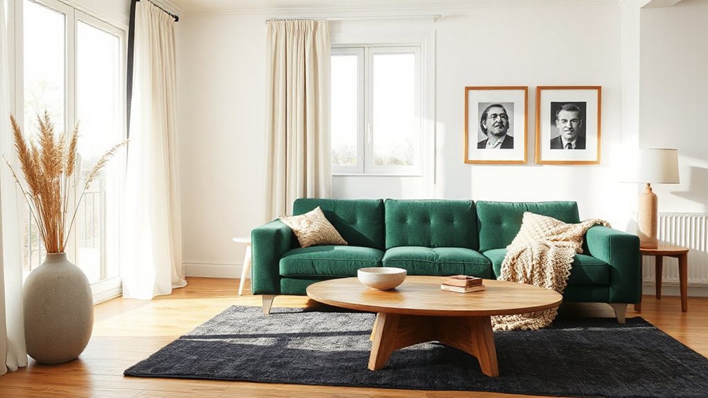

Your blank new-build is a piano waiting for the right touch of color and texture to sing. You’ll layer warmth with tactile finishes, pick pieces that tell a story, and place furniture to celebrate architectural lines rather than fight them. Keep color timeless, lighting adjustable, and accents curated—so every corner feels intentional. Start with a single, meaningful detail and let it guide the rest; there’s a path forward, if you’re ready to follow it.
Define Your Design Character for a Modern Shell

To define your design character for a modern shell, start by naming the mood you want each space to express—calm, bold, energetic, or minimalist.
You’ll sketch a quick map: where you want quiet corners, where you’ll inject dialogue with texture, color, and form.
Choose a unifying principle—art deco hints for elegance, or industrial chic edges for substance.
Decide on a constant factor, like a neutral base, then layer with intentional accents: lighting, hardware, upholstery, and artwork that reinforce the mood without clutter.
Visualize sightlines and rhythm: repeat shapes, align materials, and balance reflective surfaces with matte textures.
Keep proportions readable, avoid over-embellishment, and ensure each element supports daily living, not just looks.
This framework guides a cohesive modern shell.
Layer Texture While Preserving Clean, Modern Lines
You layer texture by mixing materials—think a tactile contrast of wood, stone, and fabric—while you maintain crisp, clean lines.
Let subtle warmth creep in with finishes and neutrals, not busy patterns, so the surfaces stay calm and modern.
Keep the edges sharp and the forms simple, then introduce texture where it reads visually and practically.
Layered Textures, Clean Lines
Layered textures add depth without clutter by combining matte woods, subtle textiles, and tactile finishes with clean, linear elements like frameless glass and slim profiles. You’ll create a sense of richness without losing the newer, crisp feel.
Start with a solid base: a neutral wall, a matte wood floor, and a restrained rug to anchor the room.
Introduce texture in cushions, woven throws, and a linen drape, keeping patterns modest to preserve visual balance.
Choose furniture with clean lines, but allow one textured piece to anchor the space—think a leather ottoman or boucle chair.
Use lighting to highlight textural contrast: directed lamps near seating, soft ambient glow across walls.
The result is a calm, contemporary zone that reads warm and organized, not busy.
Subtle Warmth, Minimal Surfaces
Subtle warmth comes from pairing tactile textures with restrained surfaces, so the room feels inviting without sacrificing its clean, modern lines. You balance this by layering Cozy textiles against smooth, flat planes, keeping color restrained and consistent.
Choose one or two textures per zone—think a wool rug with a linen sofa—and avoid competing patterns. Introduce Rustic accents sparingly: a single wood console, a live-edge board, or iron hardware that echoes architectural forms.
Keep surfaces uncluttered; texture should breathe, not overwhelm. Use matte finishes on larger planes to soften glare, then add a tactile cue at eye level for emphasis.
The result is a calm, intimate atmosphere that reads as intentional, not busy, while preserving the pared-back aesthetic you want.
Material Variety, Sharp Edges
When you mix materials, aim for a deliberate contrast that keeps the lines crisp. Material variety creates tactile interest without clutter.
Choose opposite textures—slick concrete, matte plaster, or brushed metal—so each surface reads distinctly. Keep edge transitions tight to preserve a clean, modern silhouette; sharp edges define form and prevent visual busyness.
Use high-contrast materials sparingly, and let a neutral backdrop steady the composition. Introduce warmth with a wood veneer or softly textured textile in controlled doses to avoid overpowering the geometry.
Surface joints should align with architectural lines to reinforce Edge definition. In practice, test three swaps at a time, then step back.
The goal is clear, legible material contrast that enhances structure rather than competing with it.
Warm up With Timeless Color Schemes
Warm, timeless color schemes start with simple, enduring pairings and a clear purpose for each room. You choose a base—soft neutrals or quiet earth tones—that anchors furniture and architectural details.
Then add a restrained accent palette to highlight focal areas without shouting. You’ll find that vintage accents pair beautifully with modern lines, giving depth without clutter.
Use warm whites or greiges as your backdrop, and introduce color through textiles, artwork, and small furniture pieces. Bold patterns can act as punctuation, but keep them limited to one or two zones to preserve calm.
Balance contrast with texture: linen, wool, and wood create tactile warmth.
Finally, test lighting impacts during different times of day to confirm permanence and harmony.
Elevate the Mood With Intentional Lighting
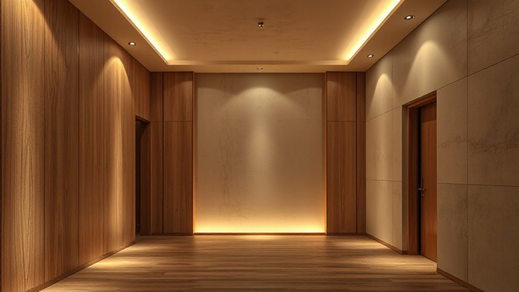
Layered lighting lets you shape mood with purpose, balancing ambient, task, and accent layers for every moment.
You’ll start by mapping how warm tones and dimmable options transform the space from morning brightness to evening coziness.
With clear goals for each layer, you’ll craft a visual path that supports function while elevating character.
Layered Lighting Goals
Layered lighting sets the mood by combining task, ambient, and accent layers to shape how a space feels and functions. You design goals around clarity, control, and rhythm, ensuring light supports activities without glare.
Start with ambient light to establish overall balance, then add task layers for reading, cooking, or work zones, and finish with accent lighting to sculpt drama and depth. Prioritize dimmability to shift mood through the day and night.
Aim for three to five focal points that guide attention—art, architecture, or textures—without shouting. Use ambient shadows to carve contrast, keeping key spaces soft yet legible.
Keep fixtures proportional to scale, avoiding clutter around focal points. This approach yields versatile, cohesive illumination aligned with architecture and daily routines.
Warm Tone Strategies
Warmth in lighting isn’t about color alone but about how temperature and tone work together to comfort the eye. When you choose bulbs and finishes with a cohesive warmth, spaces feel inviting from the moment you enter.
You’ll pair warm white LEDs with dimmable controls to tailor mood without shifting hue. Use fixtures that throw soft pools of light, avoiding harsh glare on walls.
Layer light sources: task, ambient, and accent, so vintage accents pop without competing with overall tone. Select metal and wood finishes that share a common warmth to unify rooms.
Introduce bold patterns in textiles and wallpapers sparingly, letting lighting reveal texture rather than overwhelm. Final touch: dimmer, warm-tone bulbs behind art to highlight subtle contrasts.
Select Furniture With Appropriate Scale and Personality
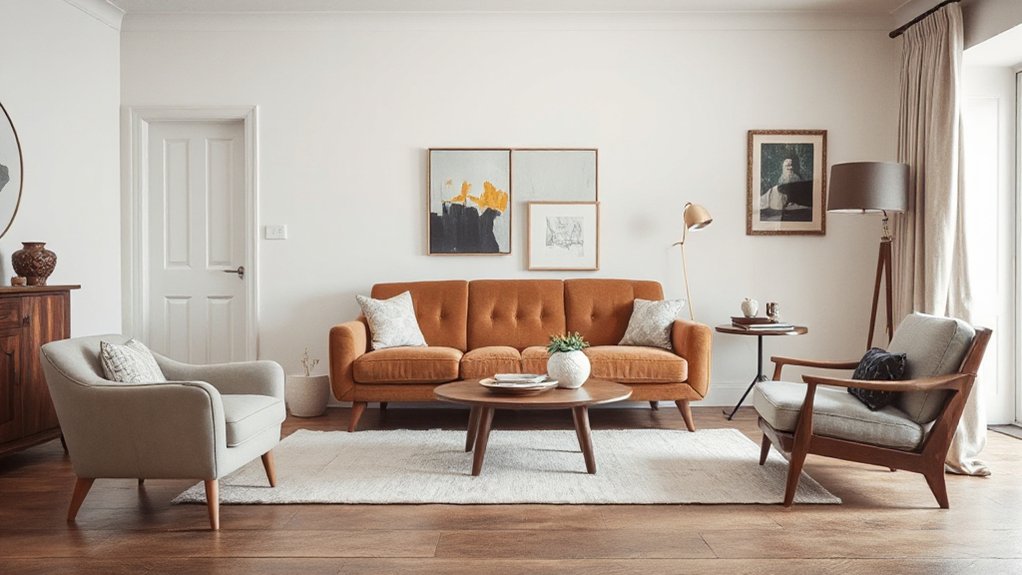
Choosing furniture that fits the room’s scale and reveals personality starts with quick measurements and a clear mood. You measure doorways, sofa length, and clearance zones, then sketch a layout that breathes.
Prioritize proportion: a long, low sofa for open spaces, compact chairs for tight corners, and a coffee table that doesn’t crowd legs. Think vertical mass as well—pillars, lamps, and shelving should balance the primary piece without overpowering the room.
Introduce character with deliberate options: Vintage accents, like a weathered sideboard or leather armchair, anchor a space without shouting. Pair bold patterns sparingly, using them on one focal item or a single rug to guide the eye.
Keep traffic clear and sightlines uninterrupted; every piece earns its size by purpose.
Accessorize With Budget-Friendly, Story-Driven Details
Place artistic accessories where they’re seen daily—tabletops, consoles, shelves—so they become conversation starters, not clutter. Curate a small rotation of pieces: one or two focal objects, plus three supporting items, all from budget-friendly sources.
Tie colors and textures to your walls or textiles to unify the scene. Use meaningful props—books, travel mementos, handmade ceramics—that tell a personal narrative.
Keep scale deliberate and avoid overfilling; negative space emphasizes each story-driven piece. The result feels intentional, lived-in, and uniquely yours.
Create Day-One Livability With Curated Layouts
Start by anchoring your daily routines in the layout you choose. Create day-one livability by prioritizing practical, curated spaces that support real use.
Start with a clear zone for cooking, dining, and cleanup, then carve a compact work nook if needed. Use space planning to balance traffic flow, sightlines, and task areas, minimizing wasted steps.
Choose architectural styles that read as intentional, not accidental, so each room feels purposeful from the first day.
Layer light sources to adapt as activities shift, and place multifunctional furniture to maximize flexibility without clutter.
Test your layout by walking through a typical morning and evening, adjusting entry points, storage, and seating until movement feels effortless.
The result: coherent efficiency with immediate comfort and character.
Frequently Asked Questions
How Do I Add Character Without Clutter?
You can add character without clutter by using vintage textiles as subtle accents and artistic lighting to highlight architectural lines. Choose one statement piece, keep surfaces clean, and weave color through textiles, artwork, and textures for cohesive, purposeful charm.
Can I Mix Eras in a Modern Shell Successfully?
Yes, you can mix eras in a modern shell. Start with vintage furniture as anchors, then layer eclectic accessories for contrast. Balance scale and color, keep lines clean, and let textures mingle to create a cohesive, visually engaging space.
What Small Budget Tweaks Create Big Impact?
In short, you can: start with decorative accessories and texture layering. You’ll mix metals, add warm lighting, and clip fabrics to echo character. You’ll see small budget tweaks create large impact, practical, precise, visually clear, purposeful.
How Often Should I Refresh Accents or Art Pieces?
Refresh accents every 6–12 months, you’ll keep spaces fresh. Rotate seasonal updates and create personalized collections so they feel intentional. You’ll visualize walls as galleries, swapping pieces as trends shift, while staying cohesive with your evolving palette.
What Color Accents Best Complement Neutral Walls?
Neutral walls pair best with bold Accent hues like teal, terracotta, or charcoal. Build a cohesive Color palette by repeating accents in textiles, art, and a rug; keep balance—one focal color dominates, others echo softly.
Conclusion
You can quickly turn a blank new-build into a home that feels like you by layering texture, color, and lighting with purpose. Start with a defined character, then mix tactile fabrics, warm neutrals, and statement art to tell your story. Keep lines clean, add personality through curated pieces, and arrange layouts for everyday flow. Fun fact: homes with intentional lighting plans report up to 40% higher perceived warmth. Small, thoughtful accents make a big, lasting impact.