
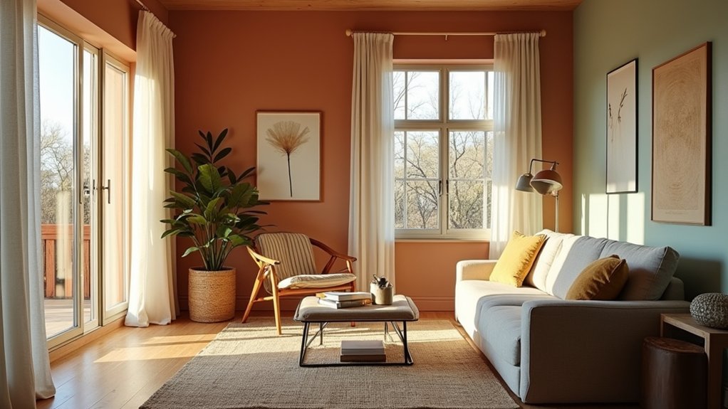

To choose the right colour palette, start with a clear anchor and layer neutrals, palettes, and accents for depth. Assess your space for natural and artificial light, undertones, and scale, then decide whether to anchor with neutrals, a curated palette, or bold accents. Build harmony through a dominant color, two secondaries, and an accent, testing in real rooms and with swatches. Keep records, adjust lighting to sustain mood, and you’ll master cohesion—and there’s more to uncover as you continue.
Color Theory in Home Design: Core Principles You’ll Use
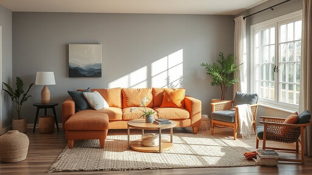
Color theory underpins any cohesive home design, guiding how hues interact to shape mood, depth, and spatial perception. You’ll use contrast, harmony, and proportion to build a balanced palette that reads confidently from room to room.
Start with a primary color as your anchor, then layer secondary tones to create nuance without chaos. Consider color psychology: warm hues energize focal areas, cool tones calm circulation zones, and muted neutrals provide neutrality for surrounding elements.
Cultural color meanings also matter; red can signify celebration in one culture or urgency in another, while blue often evokes calm universally. Apply a consistent value range to prevent visual fatigue, and reserve high-saturation accents for key features to avoid overpowering spaces.
This framework yields purposeful, timeless results.
Assess Your Space: Lighting, Undertones, and Scale
Before you pick a palette, assess the space first: lighting, undertones, and scale determine how colors actually read. You’ll want to map how natural and artificial light shifts hue throughout the day, and note how wall color, floors, and furnishings reflect it.
Consider undertones in existing finishes; a cool cast can swing a warm palette toward cohesion or clash. Analyze space proportions: ceiling height, room depth, and furniture footprint influence perceived color weight.
In compact rooms, lighter values read as airier; in expansive spaces, deeper tones ground the scene. Prioritize lighting considerations to predict true tone at key times.
Choose Your Starting Point: Neutrals, Palettes, or Accents
A clear starting point guides the entire palette, so decide whether you’ll anchor to neutrals, build from a curated palette, or spotlight accents. Your starting point sets a frame for color inspiration and guides how you test, compare, and refine hues.
If neutrals anchor you, you’ll foreground texture, light, and form, allowing color inspiration to emerge in layers and accents. If you curate a palette, you’ll establish a cohesive language first, then thread extensions through furniture, textiles, and art.
If accents call the shots, you’ll use bold, focused notes to shape mood, proportion, and flow. Regardless of choice, document your starting point, test in real rooms, and iterate with purpose.
This approach keeps decisions deliberate and your color story clear from the outset.
Build a Cohesive Palette: Harmony, Contrast, and Balance
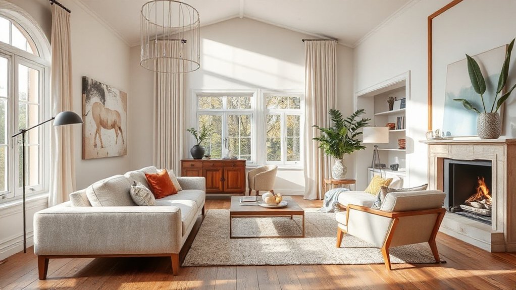
You’ll fuse your starting point into a cohesive palette by balancing harmony, contrast, and balance. A cohesive scheme relies on deliberate relationships: harmonize with adjacent tones, punctuate with deliberate contrast, and retain overall equilibrium.
Use color psychology to guide mood—cool hues calm, warm tones energize—while maintaining a unified temperature across spaces. Introduce a dominant base and build supporting roles with accent colors that recur in textiles, artwork, and hardware.
Stay mindful of Cultural color meanings to avoid misinterpretation or unintended signals in different rooms. Test scale and saturation, ensuring mids stay central while lights and darks provide depth.
Document a simple rule set: one dominant, two secondary, one accent. This discipline yields a versatile, timeless palette that feels intentional yet flexible.
Test Your Palette Before You Commit: Swatches, Apps, and Real Rooms
Start with swatch sampling to confirm color accuracy in different lighting, textures, and finishes.
Use app color matching to test palettes across surfaces before committing, then validate your picks in real rooms to see how they read in context.
This trio—swatches, apps, and room tests—keeps surprises out of your final result.
Swatch Sampling Process
Swatch sampling is your practical test bed: you compare real-world color behavior in light, on different surfaces, and at varying scales before committing. In this process, you systematically evaluate color accuracy, saturation, and warmth against your room’s existing elements.
Begin with color sampling on the primary surfaces—walls, trim, and textiles—using labeled swatches to track shifts under daylight and artificial light. Move to Swatch selection by grouping options into small, cohesive families rather than chasing every hue.
Test pairs under typical scenes: a living area, a bedroom, and a hallway, noting how adjacent colors influence perception. Document outcomes with a simple rubric: hue fidelity, depth, and consistency.
This disciplined approach minimizes surprises and aligns your palette with real-world behavior and long-term mood.
App Color Matching
Have you ever wondered whether your chosen palette truly works in practice? App color matching narrows the gap between theory and perception by letting you test tones in controlled, repeatable ways. You’ll rely on digital color matching to translate swatches into screen-accurate previews, then compare those previews to your room’s lighting and furniture.
Color psychology informs adjustments: warmer neutrals can feel intimate; cooler accents may sharpen focus. Use calibrated tools, not guesswork, to evaluate harmony and contrast across walls, trim, and textiles.
Save cyclic comparisons: daylight, incandescent, and LED simulations reveal how mood shifts with time and glow. Don’t chase trends; seek stable relationships that survive real-life variation.
When results align across devices and lighting conditions, your palette gains practical legitimacy.
Real Room Testing
Use apps to simulate echoes of your walls, but verify with real samples on large surfaces. Test multiple paint finish options—matte for understated warmth, satin for durability, and semi-gloss where washability matters—so you understand texture and sheen impact.
Consider color psychology: cooler tones can feel expansive, warmer tones intimate, but room purpose and furniture balance alter perception.
Record notes and photos at different times of day, then observe for a full week. Finalize your palette only after confirming consistency across rooms and lighting.
Adapt Palettes by Room and Mood: Practical Tweaks
Adapting palettes by room and mood starts with a clear purpose: tailor color choices to how a space feels and functions. You adjust hues to support specific activities—calm in bedrooms, focus in kitchens, sociable energy in living areas.
Start with a baseline palette, then tweak saturation and contrast to suit each room’s tempo. Use furniture coordination to guarantee dominant colors appear in larger surfaces and secondary tones echo decor accents throughout accessories.
In high-traffic zones, lean toward durable neutrals and subtle accents to hide wear; in intimate spaces, introduce richer tones for warmth. Consider lighting: daylight shifts color perception, so test swatches at various times.
Document decisions, then reproduce a coherent thread across progressions for a cohesive home.
Avoid Common Color Mistakes and Quick Fixes

Color mistakes are easier to prevent than fix, so start with a clear test plan and disciplined choices. You’ll save time by testing on large swatches, not tiny chips, and viewing lighting at different times.
Avoid relying on trend-driven palettes alone; prioritize color psychology signals that support room function and mood. Consider cultural influences that shape how hues read in you, your family, and guests, then validate with a simple feedback loop.
Keep contrast intentional: too little creates dull spaces, too much sabotages cohesion. If a color feels off, swap one element rather than reworking the whole scheme.
Quick fixes work best when you preserve underlying harmony, adjust lighting warmth, and recalibrate accents. Document choices, so future updates stay coherent.
Frequently Asked Questions
How Do I Tailor Palettes to High-Ceiling Versus Low-Ceiling Rooms?
Short answer: use lighter, cooler tones for high ceilings and deeper, warmer hues for low ceilings to balance proportion. Ceiling height informs tonal choice, enhancing visual impact and perceived room scale while preserving harmony and architectural clarity.
Can Color Psychology Influence Room Productivity and Mood Effectively?
Color psychology can influence your productivity and mood, yes. You’ll notice Color harmony guides your choices, while Emotional impact shapes daily feelings. You actively tailor palettes to boost focus, reduce stress, and sustain motivation across work-ready, comfortable spaces.
Should I Mix Metallics Within the Same Color Family or Across Palettes?
Like a conductor guiding a symphony, you should mix metallics within the same color family for metallic harmony, or across palettes for bold color coordination; choose consistency or contrast to suit your mood and space.
How Often Is Repainting Necessary When Trends Fade but Love Persists?
You’ll repaint only when paint durability wanes and color fading becomes evident, typically every 7–10 years for interior walls and longer exteriors; you’ll spotwear, not trend, guiding refresh timing rather than chasing fashion.
What’s the Best Order for Testing Palettes Across Multiple Rooms?
You should test palettes room by room, starting with the most challenging wall texture and adjusting for lighting effects. In fact, 68% of designers prefer sequential testing, ensuring each space harmonizes before moving on to the next.
Conclusion
Your home isn’t a static palette, it’s a lived experiment. When you test color like a scientist—observe how light shifts, how undertones read, how textures feel—you uncover the truth: color isn’t just seen, it’s experienced. Start with a grounded neutral, then layer with thoughtful contrasts so rooms breathe. Trust harmony over hype, adapt by room, and never fear swatches. When your eyes settle, your space whispers, “this is right for you.”