


Like a quiet postcard hinting at seaside charm, your Brighton home deserves a palette that respects history while embracing today’s textures. You’ll want neutrals that echo sand and sea, with muted blues or sandy tones as the base, then consider bold accents that nod to the arts scene without overpowering the architecture. Durability matters in salty winds, so choose marine-grade finishes and test in natural light. There’s more to map out as you plan your approach and palette choices.
Brighton Exteriors: Climate, Architecture, and Color Decisions

Choosing exterior colors for Brighton homes starts with climate awareness. You’ll weigh sun, wind, and damp patterns to pick durable coatings that resist peeling and fading in seaside conditions.
Consider how local flora shapes your palette; soft greens and muted earthy tones echo gardens and hedges, while clay reds capture brick accents seen around town.
You’ll also reflect on historical influences, since Brighton’s architecture blends Regency, Victorian, and modern silhouettes.
Align trims and fascia with masonry or timber clarity to emphasize lines and scale, not overwhelm them.
Practical choices include UV‑stable finishes, breathable surfaces, and subtle gloss on shutters for depth.
Test swatches near landscaping to preview how foliage and seasonal light shift your color perception throughout the year.
Start With Neutrals: Sand, Sea, and Architectural Harmony
Start with neutrals as your foundation: sand, sea, and architecture work best when you establish a quiet, unified canvas before layering accents. You’ll choose sand and warm off-whites first to set a breathable base, then add muted blues or greiges as secondary tones to echo Brighton’s shoreline. This approach preserves architectural harmony and makes future color edits easier.
Consider color symbolism: neutrals convey calm and timeless appeal, while subtle sea-tones hint at coastal life without shouting.
Historical influences matter: you’ll notice traditional cladding and brick tones historically paired with soft whites, so your palette respects those legacies while remaining modern.
Keep contrast gentle, avoid harsh edges, and test samples in different light to confirm the cohesive, practical finish you’re aiming for.
Bold Accents That Nod to Brighton’s Arts Scene
You’ll see bold hues echo Brighton’s arts scene in confident exterior accents that stand up to sea breezes. Pair vibrant accents with the calm neutrals you’ve already chosen to keep the home grounded yet expressive.
Use crisp, durable finishes and consider color stories that reflect local galleries and street murals for a cohesive curb appeal.
Bold Hues Echo Arts
Bold accents are a bold nod to Brighton’s arts scene, turning exterior walls into statement pieces that echo gallery walls and street murals. You’ll harness bold hues to frame architecture, balancing contrast with surrounding textures like brick, timber, and stone.
Choose colors whose meanings align with your home’s vibe: deep blues suggest authority and calm, while rich greens nod to nature-inspired palettes; all can energize a façade when paired with neutral trims.
Consider historical influences—muted undertones from era-appropriate palettes can ground modern color experiments without overwhelming the street. Test samples at different times of day to gauge color psychology in real light.
Apply these hues selectively on architectural features to avoid visual clutter, ensuring your bold choice enhances curb appeal while preserving longevity and harmony with Brighton’s artistic rhythm.
Vibrant Accents, Brighton Scene
Vibrant accents can instantly echo Brighton’s arts scene, turning a home’s exterior into a dynamic canvas without overwhelming its architecture. You’ll want bold trims, doorways, or shutters that pop against a neutral base, but keep the palette balanced to avoid visual clutter.
Choose colors with clear contrast yet cohesive undertones to respect the surrounding streetscape. Use color psychology to cue mood—energetic reds or sunny yellows for inviting curb appeal, calmer teals or olive greens for grounded charm.
Consider cultural influences in murals, signage-inspired stripes, or art deco hints that nod to local history without overpowering your home’s silhouette. Apply accents selectively, test samples at different times of day, and guarantee hardware finishes harmonize with the chosen tones for a refined, intentional finish.
Weatherproof Finishes for Salty Air and Wind
Salt- and wind-prone coastal air demands paints that seal and stay put, so start with finishes that resist salt spray, UV fading, and peeling. For Brighton homes, look for marine grade finishes designed to endure salt-laden breezes and abrasive sands.
Choose salt resistant coatings that form flexible films, resisting cracking as winds push against siding. Prioritize primers with corrosion inhibitors on metal elements and masonry sealers for brick or stucco, ensuring moisture stays out.
Topcoats should offer excellent UV stability and mildew resistance, while maintaining color integrity in bright sun. Consider satin or low-sheen finishes to hide texture and wear.
Pair with beneficial maintenance cycles, and recoat intervals around three to five years to preserve protection and curb touch-ups.
Exterior Color Palettes by Brighton Architectural Style
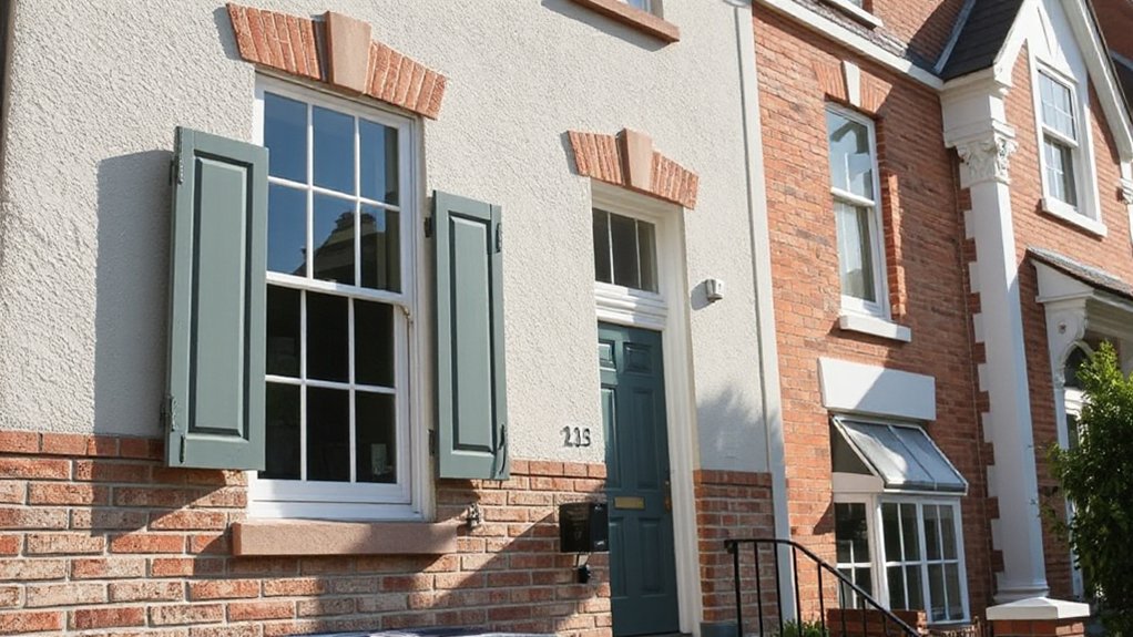
Consider how Brighton’s architectural styles guide color choices, from Classic Brick tones that highlight heritage to Coastal Neutrals that soften seaside silhouettes.
You’ll see Modern Contrast schemes that sharpen curb appeal without overpowering coastal vistas, pairing muted timbers with crisp whites for balance.
Classic Brick Tones
For brick restoration, inspect mortar joints first; repaint only after repointing to maintain historic integrity. If you seek longevity, lean into breathable primers that prevent moisture trapping behind brick. Consider custom blends that echo nearby facades but avoid overpowering neighboring homes.
In practice, test chips at varying sun exposures, and record fade progression to guide future touch-ups. This palette supports durable, timeless charm for Brighton residences.
Coastal Neutrals Palette
Begin with a light sandy base as the primary wall color, then layer with a muted sea blue for doors or shutters to introduce coastal charm without overpowering features. Accessorize with charcoal trims to define windows and corners, ensuring durability against salt spray and sun.
Consider matte finishes to reduce glare and reveal subtle undertones across seasons, enhancing seaside serenity in cooler months. This palette favors consistency across fences, siding, and porches, delivering cohesive curb appeal that remains timeless rather than trendy.
Modern Contrast Schemes
What makes Modern Contrast Schemes stand out in Brighton’s exterior color game is how they pair crisp, saturated accents with restrained neutrals to highlight architectural details without shouting for attention. You’ll notice sharp door frames, window trims, and cornices pop against matte bases, while steel blues or charcoal blacks anchor brick and render.
Choose a light base to keep curb appeal bright, then introduce a bold hue on focal elements like front doors, shutters, or accent walls. For landscape integration, coordinate planting with the palette—greens and rusty reds harmonize with muted neutrals.
Historical influences show up in heritage whites and deep greens, subtly nodding to period features. Maintain consistency across materials and textures to preserve a cohesive, contemporary Brighton look.
How to Pick Exterior Swatches in Windy Lanes
Choosing exterior swatches for Windy Lanes means factoring in gusty days, sun exposure, and the lane’s textures, so you’ll pick colors that hold up in weather and still look sharp.
Start with durable bases: semi-gloss or satin on trim for clean reflections, matte on walls if you want subtler tones.
Examine Windy Lane textures—brick, stucco, wood—since each finish reads color differently.
Test swatches under sun at different times, and near adjacent surfaces to see how they shift.
Prioritize high-contrast combinations for visibility from a distance, but avoid overly bright hues that fade quickly.
For paint adhesion tips, prepare surfaces properly, prime cracked areas, and choose high-adhesion primers in windy climates.
Document results and refine choices before final coats.
Light and Shade: How Brighton Light Affects Color
Brighton’s light plays a big role in how color reads on exterior surfaces, so you’ll want to observe how daylight shifts your swatches at different times of day and across seasons.
In practice, assess how Sunlight influence changes the hue of your chosen tones from pale mornings to bright noons and dusky evenings. Note that warmth can intensify yellow or orange undertones, while cooler light softens contrast.
Shade variations matter too: north-facing walls appear cooler and more muted, while sunlit facades pop with richer saturation.
Pair neutrals with strategic accent colors that hold their ground under shifting rays. Maintain a concise palette, allowing textiles, roofing, and surroundings to harmonize without competing for attention.
Observe consistently, then finalize with confidence.
Practical Guide to Testing Swatches on Your Facade

To test swatches effectively on your facade, start with a controlled setup: gather several paint chips or small samples, apply them to a clean, dry area, and give each swatch ample time to cure in natural light before judging. This guarantees true color read under Brighton’s conditions, not indoor lighting quirks.
Use a simple evaluation routine that weighs color psychology cues (most perceived mood) and paint durability indicators (finish, grain raise, and washability).
- Place swatches at multiple heights and orientations to observe glare and shadow shifts.
- Note undertones under daylight, warm vs. cool ambience, and how the hue interacts with neighboring materials.
- Test with a small accent edge to preview contrast and cohesion.
- Mark preferred options for larger panel testing later.
Maintenance Tips to Keep Color Vibrant Over Time
Maintaining vibrant exterior color over time requires a proactive routine that tackles cleaning, protection, and timely touch-ups. Start with a monthly wash using a mild detergent and a soft brush to remove dirt, mildew, and pollutants that dull color. Rinse thoroughly to prevent residue that can trap grime and degrade finish.
Inspect edges, seams, and trim for cracking or peeling; address small repairs before they spread. Use a UV-blocking, breathable sealant on exposed wood or porous surfaces to extend paint life. Consider low- or zero-VOC products for repaints to protect nearby plants and air quality.
For durability, follow the manufacturer’s recoat intervals and maintain shade-tolerant placement to avoid color fading. Experiment with creative color combinations on small updates to refresh curb appeal while preserving paint durability.
Budgeting for Paint, Prep, and Long-Term Curb Appeal
- Define quantities and wastage allowances
- Budget for surface prep, caulking, and priming
- Allocate funds for weatherproof seals and hardware
- Schedule coatings with seasonal windows for ideal cure
Case Studies: Real Brighton Homes and Their Colour Journeys

Case studies from Brighton homes show how real choices translate into curb appeal. You’ll see how owners pair historic cues with modern palettes, balancing charm with daily practicality.
In one journey, a classic weatherboard shifts from muted creams to a slate-blue with crisp white trims, echoing historical influences while staying cohesive with neighboring period homes.
Another project leans into brick and render, selecting earthy taupe and charcoal accents that highlight architectural details without overpowering streetscapes.
You’ll notice the speed and ease of sourcing from Local paint suppliers, which keeps timelines tight and colors faithful.
These case studies prove it’s not about chasing trends, but about informed decisions that age gracefully, resist fading, and align with your home’s unique rhythm.
Frequently Asked Questions
How Often Should Exterior Paint Be Re-Coated in Brighton?
You should re-coat every 5–7 years, depending on sun exposure and wear. Inspect annually, touch up peeling areas promptly. Use garden landscaping-friendly maintenance practices and energy efficient coatings to extend color life and curb appeal in Brighton.
Which Sheen Lasts Best Against Salty Coastal Winds?
Did you know 85% of coastal homes report less fading with UV resistant coatings? You’ll want eco friendly finishes, plus UV resistant coatings, for lasting color. You stay practical, choosing trend-conscious, durable options against salty winds.
Do Clay Bricks Affect Neutral Color Choices in Brighton?
Yes, clay brick compatibility matters: you’ll want a neutral palette, like warm grays or taupes, that harmonizes with brick texture. Consider muted greens or ochers for contrast, ensuring your neutral palette suggestions stay balanced and trend-conscious.
Can Roof Color Influence Overall Home Perception From Street?
Yes, your roof color influences street view aesthetics and overall perception. You’ll notice it complements materials and shapes. Consider roof material durability, then pick hues that harmonize with your facade for a cohesive, trend-conscious street presence.
What Colors Compliment Nearby Historic Structures in Brighton?
“Paint fades, but quality lasts.” You choose colors that echo nearby historic structures, favoring muted coastal tones with warm whites and slate blues in a Coastal color palette, supporting historic preservation while staying practical, trend-conscious, and detail‑oriented.
Conclusion
In Brighton, your home’s color journey blends coast and character with practical choices you can live with. Start neutral, test under natural light, and add deliberate accents that nod to the arts scene. Pick marine-grade finishes to withstand salty winds, and tailor palettes to architectural style for lasting curb appeal. With careful prep, smart budgeting, and real-world case insights, your facade stays vibrant through seasons, while timeless tones keep your home stylish today and tomorrow.