
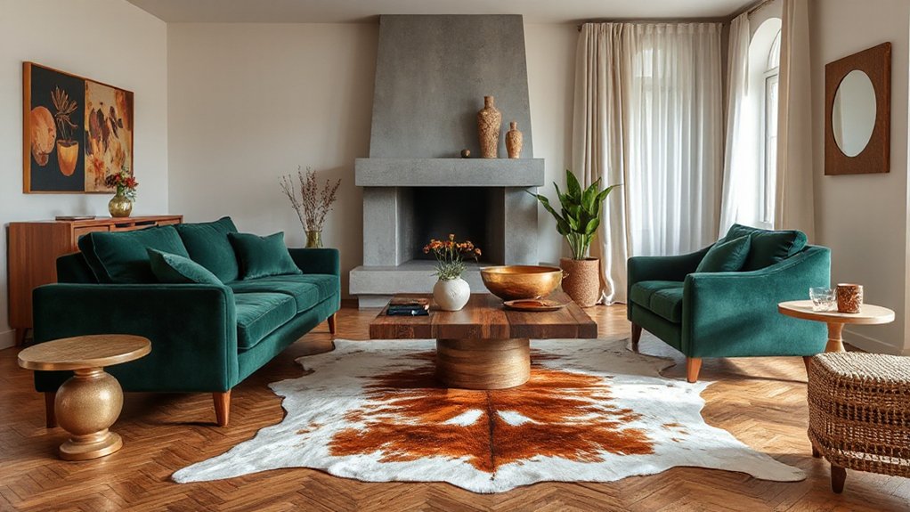

You’ll notice a coincidence: the moment you mix textures, light reveals new depth. Start with a grounded core of wood, stone, and metal, then layer warmth with velvets and linens, keeping scale balanced between bold surfaces and delicate details. You’ll want a cohesive rhythm across finishes, and smart accents will pull it together without shouting. Ready to tune the contrasts and watch a designer-look emerge? Let’s move forward with purpose.
Define the Room’s Purpose to Guide Textures
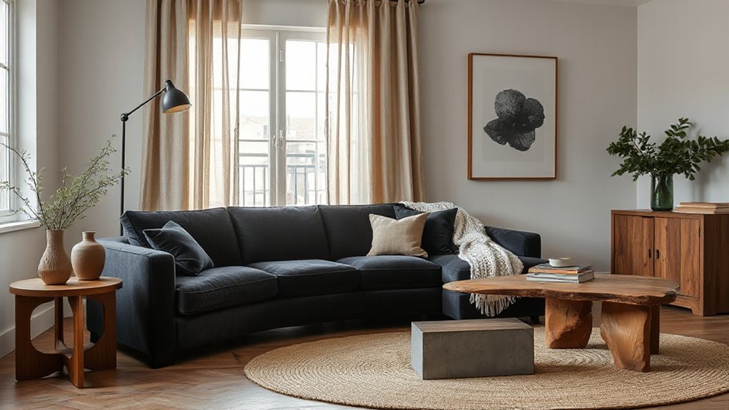
Determining the room’s purpose sets the texture framework. You define how textures work together by clarifying the room’s function, traffic, and desired energy.
Start with purpose clarity: is this a calm retreat, a social hub, or a focused work zone? Your answer guides material choice, scale, and finish.
If you need quiet and warmth, favor soft textiles, matte surfaces, and natural fibers. For high-energy rooms, lean into contrast, gloss, and tactile drama.
Consider how mood setting influences repetition and layering: repeat a core texture or color to unify disparate pieces, then introduce contrasting textures to add depth.
Align hardware, lighting, and furniture scale with the established function, ensuring durability where needed and comfort where it matters most.
Ground Your Palette With Core Materials
Start with a neutral foundation: limestone or concrete for ground plane, a warm wood tone for warmth, brushed metal accents for tech edges, and a durable fabric seat or drapery to soften lines. Use these anchors to calibrate scale, sheen, and tactile interest, avoiding mismatched extremes.
Keep edges crisp and joints deliberate, so progression feels purposeful, not accidental. When you choose new pieces, ask how they reinforce the anchors, how they deepen texture contrast, and whether they maintain material harmony throughout the space.
Layer Warmth and Contrast: Wood, Metal, and Stone
You’ve laid a solid anchor set; now it’s time to layer warmth and contrast with wood, metal, and stone. Begin by selecting a dominant material for structural balance—warm wood, cool metal, or rugged stone.
Introduce the second material as a deliberate accent, keeping scale and texture in check. Aim for textural harmony: pair a smooth metal surface with a tactile wood grain, or contrast a matte stone finish with polished metal edges.
Use stone to ground lighter woods or metals, then pull warmth back with textiles and subtle coatings. Guarantee material contrast remains purposeful, not decorative.
Control reflections, patinas, and grains with consistent lighting and hardware finishes. Finally, document your choices to preserve a cohesive, designer-look result.
Add Depth With Fabric Texture

Texture texture layering begins with choosing fabrics that add visible depth. You’ll balance soft fabrics with bold accents to keep surfaces dynamic without overwhelming the space.
Use tactile contrasts—think matte velvets against crisp linens—to guide the eye and reinforce your designer look.
TextureTexture Layering
Texture layering adds depth to a design by pairing fabrics with contrasting surfaces and weights. You’ll balance the tactile qualities by pairing a tight-weave drapery with a plush rug, then anchor the space with a smooth leather chair.
Prioritize textural contrast without sacrificing cohesion; each element should read as a deliberate choice, not an afterthought. Consider how light interacts with each surface—matte textiles soften glare, while a satin finish adds subtle sheen.
Maintain material harmony by repeating a shared undertone or color across fibers and substrates, ensuring the palette remains cohesive. Use scale deliberately: large textures foreground, smaller textures support, creating rhythm.
Avoid overcrowding; restraint strengthens the designer look and preserves the intended tactile hierarchy.
Soft Fabrics, Bold Accents
Soft fabrics don’t just feel inviting; they create the stage for bold accents to pop. You’ll pair these textures with clean lines and neutral bases to avoid crowding the room. Start with a solid foundation—plush upholstery, a wool rug, or velvet cushions—and leave breathing room around standout pieces.
Then introduce bold accents: a painted statement chair, a metallic lamp, or a geometric textile wall hanging. Use contrast in color and scale to emphasize texture without overwhelming the space.
Limit patterns to one or two strong prints, letting soft fabrics absorb light and soften edges. Always test undertones under both daylight and artificial light, ensuring soft fabrics and bold accents remain cohesive and purposeful, not competing.
Balance Scale: Mix Large Surfaces With Delicate Details
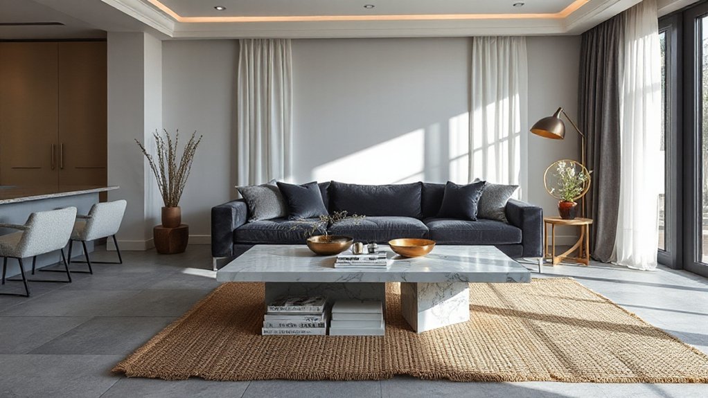
To balance large surfaces with delicate details, start by establishing a clear hierarchy: bold planes anchor the design, while fine textures and refined accents draw the eye without competing for attention.
You achieve scale harmony by pairing expansive, matte panels with subtle, tactile finishes. Use lightweight, intricate details—like narrow trim, fine stitching, or barely-there patterns—to punctuate the surface without breaking the surface’s dominance.
Keep color restrained on the large planes; reserve contrast for the details to maximize emphasis. Place a single focal feature to guide the eye, then repeat a refined motif in small doses elsewhere.
Maintain precise alignment and proportional gaps to preserve coherence. This approach guarantees detail emphasis remains intentional, not decorative, delivering a calm, coherent designer look.
Color and Light: Finishes and Glow
Color and light shape how finishes glow across textures. Start by balancing lighting warmth, contrast, and finish sheen to control mood and depth.
Consider reflective surface layering to add dimension without competing with the core materials.
Lighting Warmth Contrast
Start with ambient glow at a comfortable level, then layer task and accent lighting to reveal texture without overpowering color. Use a mix of metal, wood, and fabric finishes that respond to warmth differently, observing how shadows fall and edges soften or sharpen.
Maintain consistency: choose a dominant temperature for general lighting, and introduce subtle variations for emphasis. In practice, monitor how lamps and dimmers alter surface interpretation as you move through the room.
Shadow play should reinforce form, not obscure detail or reduce clarity.
Finish Sheen Balance
Begin with glossy finishes on focal pieces to catch eye movement, then soften with matte textures in surrounding areas to ground the scene. Satin often bridges extremes, providing gentle diffusion without flatness.
Consider space and purpose: high-gloss tables can reflect activity, while walls in matte reduce glare. Keep contrast deliberate: too much shine creates chaos; too little dulls energy.
Calibrate by testing in varied light hours, noting how each texture reads from different angles. Glossy finishes attract, Matte textures calm, and the balance delivers cohesive modern polish.
Reflective Surface Layering
Why settle for flat walls when you can layer reflective surfaces to amplify depth and glow? Reflective surface layering sharpens contrast between elements and elevates perceived space.
Begin with a base in a matte or satin finish, then introduce restrained reflective surfaces—glass, high-gloss lacquer, or mirror tiles—only where they’ll catch light.
Use Layered gloss on cabinetry or accent panels to create focal points without shouting. Balance is essential: pair shiny elements with textured textures to prevent glare and maintain warmth.
Consider light direction; place reflective surfaces to bounce natural daylight into deeper corners, and make sure artificial lighting complements the sheen rather than competing with it.
Keep proportions deliberate: small accents, strategic placement, deliberate repetition, and consistent color or metal tones throughout.
Create Cross-Texture Cohesion With Accent Pieces
So how do you create cross-texture cohesion with accent pieces? You target contrasts and ties, using accent pieces to bridge disparate materials without stealing attention from key furniture. Start with a unifying color or finish, then pick items that echo existing textures in smaller doses.
Textural harmony emerges when you layer tactile cues—soft textiles with rough surfaces, glossy with matte, warm wood against cool metal. Use accents to repeat a motif, not overwhelm it, ensuring Material contrast feels intentional and balanced. Keep scale varied, so pieces relate but don’t clash.
Finally, place accent pieces where you spend time, like seating nooks or entryways, for immediate impact.
- Repeat a shared color across textures
- Pair a soft textile with a hard surface
- Vary sheen to emphasize depth
- Use one bold piece as a unifier
Troubleshoot Common Mistakes and Smart Fixes

Mistakes happen when texture choices start competing instead of harmonizing. Here, you’ll spot common missteps and apply sharp fixes.
First, if you notice texture clash, pause and re-balance scale: mix large with small, avoid repeating the same surface visually, and introduce a unifying color or finish.
When material mismatch appears, reassess function versus style—choose durable, easy-care options for high-use zones, then pair with refined textiles for softness.
Simplify palettes to prevent chaos: limit to three complementary finishes per room, one dominant, two supporting.
Use samples on a wall or board to test light and texture interaction before committing.
Finally, align upholstery, flooring, and accents to a cohesive hierarchy, ensuring every element serves the room’s intended mood and traffic needs.
Frequently Asked Questions
How Can I Measure Texture Density Across a Room?
You measure texture density by surveying surface variety across zones, noting material contrast and tactile variety. Use a consistent grid, count distinct materials per 10-by-10 feet, and record counts to guide balanced, cohesive layering throughout the room.
Which Textures Feel Durable in High-Traffic Spaces?
You should prioritize durable textures like high-tenacity synthetics and coated leathers. You’ll perform durability testing and compare materials critically, noting abrasion resistance and cleaning practicality, then make a material comparison to choose resilient options for high-traffic spaces.
How Do I Layer Textures Without Overwhelming the Space?
Layering techniques keep your space balanced; start with a neutral base, then add tactile accents. You’ll pair durable textiles with smooth surfaces, using Material combinations thoughtfully to avoid clutter. Aim for contrasts in scale, color, and texture for cohesion.
What Lighting Enhances Textured Finishes Best?
Ambient lighting highlights textured finishes best, while accent illumination adds depth. You’ll want a mix of soft ambient glow and targeted accents, using warm temperatures, dimmers, and precise placement to avoid glare and emphasize material nuances.
Can Texture Choices Affect Room Acoustics?
Yes, texture choices can affect room acoustics. You’ll influence sound absorption and acoustic balance by selecting materials with appropriate porosity, density, and surface treatments, balancing hard and soft elements to manage reflections and overall clarity.
Conclusion
You’ll see it instantly: the room shifts from “meh” to magnetic the moment textures collide with intention. When you mix woods, metals, and stone, you reveal depth that screams designer, not DIY. Layer fabrics for warmth, balance bold surfaces with delicate details, and let finishes glow like a perfect spotlight. Stay disciplined with repetition, confident with contrast, and fearless with accents. Do this, and your space explodes into polished, aspirational luxury—without breaking the bank, or your temperament.